
As heat waves become more common, more intense, and more lethal, the contrast between news articles that spell out the impact of extreme heat and their accompanying “fun in the sun” photos becomes more jarring.
In a newly released pre-print, researchers looked at how newsrooms were visually representing climate change and extreme heat by analyzing roughly 250 pieces of online news coverage about the 2019 heat waves in France, Germany, the Netherlands, and U.K. (That’s “canicule,” “hitzewelle,” “hittegolf,” and “heat wave,” respectively.)
For the research, both the image and text were evaluated for positive, negative, or mixed valence. A negative valence presented the heat wave as worrying, risky, dangerous, and/or inconvenient, while a positive valence invoked concepts like vacation, leisure, and relaxation. In the images, researchers also looked for themes. Was the white-hot sun beating down? Did the photo show cracked earth? Were humans in frame and were they having a good time?
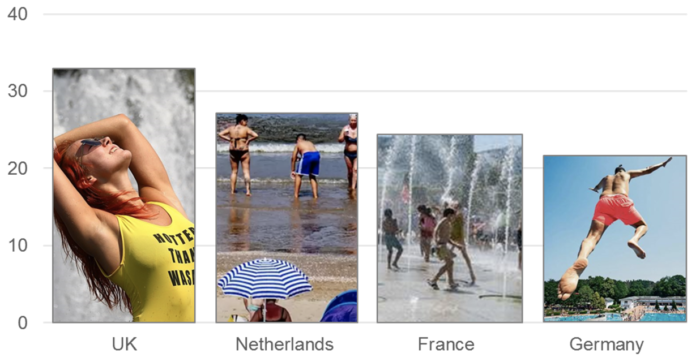
Across all four countries, 31% of the accompanying images were what the authors deemed “positively valenced” — in short, they showed people having fun in the sun. Although not the majority in any country, the single most common type of image in each country was photographs showing people enjoying themselves near or in water.
Images with people swimming, sunbathing, or splashing around accounted for 33% of U.K. coverage, 27% in the Netherlands, 26% in France and 22% in Germany. (Some were iconic enough to jump borders; photos of people in fountains in front of the Eiffel Tower popped up in all four countries.) Here’s a bar graph the researchers made using a “typical image” from each country’s dataset:
There was a stark contrast between texts (less than 1% of the actual articles positive) and images (again, nearly one-third were positive) in the news coverage. Saffron O’Neill, the paper’s first author and an associate professor of geography at the University of Exeter, said that once she started noticing the “fun in the sun” type photos, “it’s hard not to see them every time a heat wave is forecast.”
“Too often, the visual communication of climate change is neglected. As academics and journalists, we can obsess over getting the phrasing of an article spot-on, but then attach, almost carelessly, an image to the document or article,” she added. But “images are a key part of the communications process — shaping how we think, feel and act on climate change.”
Some news coverage examples cited in the paper:
On the website of French media organization 20 Minutes, the headline and sub-heading ran: “Heat wave: What do the four levels of the national plan provide? HEAT The national heat wave plan was created after 2003 and the tragic summer during which 15,000 people died due to very high temperatures.” It accompanied a picture of children and young people playing in a city splash park.
In Germany, a headline in the tabloid newspaper Bild, “Hottest June ever — worldwide” accompanies a detailed article about the danger of climate change and heat waves, including even an infographic depicting how climate change will threaten iconic species like polar bears and places like the Great Barrier Reef. Yet the lead image accompanying it is of a holiday snap — a man jumping from a diving board into a swimming pool.
In the UK, an attractive, smiling young woman leans back into a city fountain, her top displaying the double entendre “hotter than wasabi.” It accompanies a Daily Mail article headline which begins: “Hotter than hell! ‘Vicious’ Saharan Bubble heat wave roasting Europe kills three swimmers.”
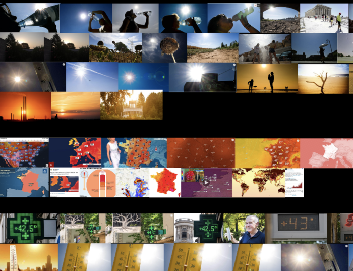
Another common theme was invoking the idea of heat through orange and red colors, thermometers, and bright sunbursts. The researchers found identifiable people were largely absent from these “idea of heat” photos. Instead, when people were pictured it was mostly in shadow silhouetted against the sun.
“When images did depict the danger of heat extremes, people were largely absent,” the researchers wrote. “We conclude that this visual framing of heat waves is problematic: first, by displacing concerns of vulnerability, it marginalizes the experiences of those vulnerable to heat waves; and second, it excludes opportunities for imagining a more resilient future.”
The paper included some examples — and the one accompanying this piece probably counts, too:
So what can journalists do? Is there something especially difficult about finding photos for stories about heat waves?
“I don’t think there’s anything inherently tricky about heat waves that makes them difficult to visualize — compared to, say, visualizing an abstract concept like ‘climate change,'” O’Neill said. “I think we only need to look at other places in the world to see how we could visualize extreme heat differently. For example, the Indian-Pakistan subcontinent heat wave earlier in 2022 produced a wealth of very different types of heat wave image to the ‘fun in the sun’ images which are so dominant in Europe and North America.”
Among the European outlets studied for the paper, one newsroom was singled out for special praise.
“Climate solutions imagery was absent throughout almost the entire dataset, except for one outlet — the Netherlands local and regional news organization Algemeen Dagblad (AD),” the authors wrote. AD avoided some of the worst heat wave tropes and used visuals with themes that the researchers ended up categorizing as “health and wellbeing” and “other” far more than other outlets. (Some of the ones included in the study pictured elderly people eating ice cream inside of a care home, a young family dealing with the heat at home, an air-conditioned town hall made available for vulnerable locals, and a green space project designed to reduce the urban heat island effect.)
“The AD photographs effectively brought climate change, and heat extremes, closer to home; in ways which opened up the visual discourse to concerns of justice and equity,” the authors wrote. “It may be that as a local and regional outlet, AD focused on local stories of how people were coping with the heat, and commissioned freelance photographers for specific images to accompany these stories.”
For more discussions about visualizing climate change, you may want to check out this Reading the Pictures conversation about an effective series or browse Climate Visuals. You can read the full paper here.
This story was originally published on Nieman Lab and republished here with permission.
Photo by priscilla m rodriguez on Unsplash.