Tristan Ferne, the lead producer for the BBC’s research and development unit, wrotein a recent 2,043-word post, “Could we combine existing media to make online news more accessible, engaging and relevant to young people?”
“With an 800-word article, there is no interaction,” Ferne said. “This audience is spending all their time in Snapchat and Twitter, where there’s constant interaction in the interface. There’s stuff to do with your thumbs: You can swipe, scroll, tap. We found that [users] expected that.”
Many news organizations are looking to move beyond text. The Guardian Mobile Innovation Lab, which operated for two years, tested an interactive podcast player, “Smarticles,” an offline news app, and live push notifications. Newsrooms like The Washington Post have been experimenting with AMP stories boosted by Google’s toolkit, similar to Snapchat or Instagram Stories. The BBC has also been working on more exchanges with its audience like in-article chatbots and improved vertical video within the app.
Ferne and his four-person team — one journalist, one designer, one user researcher, and one developer — spent two months experimenting with 12 prototypes, all intended to move the BBC beyond standard 800-word articles. They used “a bit of guerrilla testing on the streets of London near universities,” and also tested things out on a group of 26 18- to 26-year-olds. Here’s some of what they learned (and more is here).
What worked
The Expander — This item is already in use at other outlets, like The Guardian, and Ferne said it’s going to be tested on the BBC’s site starting next month. When readers see a yellow ellipsis after a key term/event/name/etc., they can click on it to pop out some more information.
The Incremental — The audience favorite, this choose-your-own-adventure style format can indeed reuse content, but requires a heavy editor lift by creating the same content in various forms. The story is segmented with options for a video clip, short-, or long-text route for the next segment, or you can skip the next part entirely. “We think it could be a kind of longform by stealth — a way of engaging people put off by long articles or lots of sidebars and related article links,” Ferne wrote.
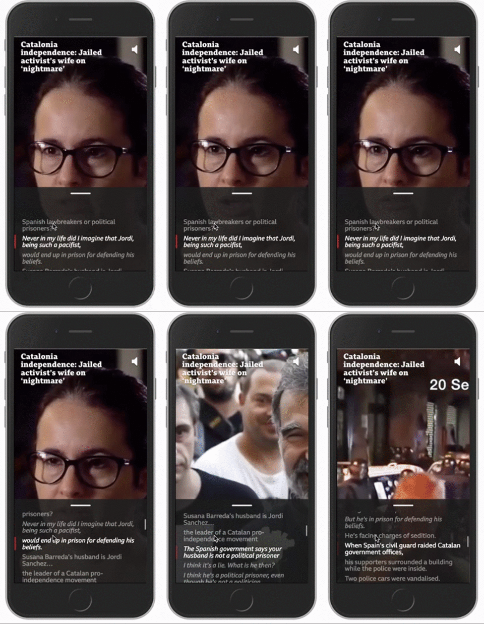
Fast Forward — Scrollable. Video. Synchronized. To. The. Transcript. It’s like subtitles, but actually useful for moving around in the video without missing a segment or nudging your thumb just too far to the right. Skimmable video? Yes please.
Viewpoints — This reminded me of Snapchat’s polls in the Good Luck America series, where, after diving into issues like the removal of Confederate statues, users were prompted to vote on their conclusions. For the BBC’s Viewpoints, users encounter an introduction to a topic followed by short videos of people describing their opinion, either for or against. Then the users are asked to weigh in. Imagine a Tinder-inspired Opinion section 2.0 of a news website, but with less nasty commenting and more putting-a-face-to-an-issue-ing.
What didn’t work
Atmosphere — Setting the stage with background audio when users started reading an article was too distracting for testers. “Young people are trying to navigate a difficult path between information overload and FOMO,” Ferne wrote in the post-mortem, and the addition of audio created sensory overload too.
Consequences — More buttons! This prototype invited uses to select their topical issue of choice, in an attempt at personalization or at least relatability, after reading a shorter article. Tapping on one icon would reveal a bulleted summary with the impact (consequence!) of that news item on, say, the environment; another, the economy, and so on. “People told us they want to know the impact the story has on them. But that’s hard because you don’t know what people do or who they are,” Ferne said. “By breaking it down, they can choose what they care about.” This prototype was better-received than the team had anticipated due to its simplicity in formatting — still pegged to an article — but the team decided not to advance this idea to the next round. “There was nothing fancy about it.”
Drawing In — It’s not exactly Star Wars, but the way Ferne describes it conjures that image: “We tried to present a story like the intro to a movie. We started with background sound and blurry visuals and as you scrolled it came into focus and there was a bit of background video, like the scene of the story before the story came in,” he said. It flopped bigger than the Solo spinoff movie: “The idea that we could ease people into the story was wrong,” he said. “People want to know what the story is about before they decide to invest time into it.”
Messages — In a generation already fraught with anxiety, inviting users to watch a reenactment of a WhatsApp conversation between a journalist and their source in a disaster zone wasn’t exactly the biggest hit. “It was authentic and raw and captured people’s imaginations, but it was too distressing,” Ferne admitted.
The R&D team’s year-long hunt for feasible new story formats wraps up in September, though its contributions to the storytelling scene are ongoing. The Expander will begin its pilot next month and further prototypes may be rolled out after further testing, Ferne said. Other BBC teams are continuing work on voice prototypes and chatbots, and of course they have some folks thinking about the ethics of all this journalism technology too.
Now vote: In which format do you think this article should have been?
This post was originally published on NiemanLab. It was edited for length and republished on IJNet with permission.
Main image CC-licensed by Unsplash via Daria Nepriakhina. Video and gif courtesy of BBC Research & Development.

