This video is the latest project I’ve done with visual storyteller and ICFJ Knight International Journalism Fellow Mariana Santos. It was published this weekend for International Women’s Day — the theme of which this year was inequality. We decided to focus on some of the reasons why, even in 2014, women are still losing this particular game.
Mariana and I have made a few of these animations now and we’re still working together on how to make them perfect. I love Mariana’s sense of visual style, and her animations are often witty in a way I hadn’t even thought of when preparing the scripts for her.
We have a good method now: first, we work together on an idea that we both like. Then I will gather the data and produce the script (as a spreadsheet, natch) while Mariana conceives and executes some really tricky stuff (often to incredibly tight deadlines). It’s a partnership: Mariana, seeing the script for the first time, always comes back to me with really astute questions about the data, or things I might have missed. She also has an innate sense of what would make it too long and how it should look.
So, here’s what I’ve learned about writing for data animations so far:
- The data is the easy bit and takes the least time — make sure to build in enough space for the animator to do their work without having to rush. I’d like to say we’ve always done this but that would be untrue.
- You have to be selective — it doesn’t take much data to fill up two minutes. Our first animation, the 99 percent v. the 1 percent — is still my favorite but if we were to do it again I would try to edit the data down a bit more to make it shorter.
- On one level, writing a script is a bit like doing a great presentation: don’t use too many words. You don’t have to spell out all the data if that’s what the image is doing. Otherwise you end up like one of those powerpoint slides where someone has written out everything they are saying right in front of you.
- Provide enough data to animate so that it helps tell the story; but not so much that it gets overwhelming. I tend to provide a table of, say, a list of countries, but pick out the ones that should be included (for what it’s worth, this also applies to how I generally work with graphic artists — make sure they have all the information but help pick out the key bits).
- You’re not writing an article — read the script aloud to see how it sounds before committing.
- Try to get as much right in advance as you can — it’s no good having a stroke of genius when the final video is being rendered (that can take hours, by the way).
- Sort out the music as early as you can — has always been one of the hardest tasks. It takes us ages to agree on which strikes the right tone and we have had libraries of music to choose from.
- And on that tone, think about who will do your voiceover — we had my colleague Shavone Charles for this one.
- Trust the animator and designer — the chances are they know a lot more than you do anyway.
The great thing about data journalism is that you’re never done learning how to do it — I’m still learning how to do this.
The script for the video above is below — and click this link to get the data behind it and full sources.
- There are 865 million women around the world who have the potential to contribute more to their national economies. 812 million of them live in emerging and developing countries. The difference between men and women able to work is the gender gap. In the next decade, those 865 million women will grow to a billion.
- It’s different all over the globe. Some countries are more equal than others.
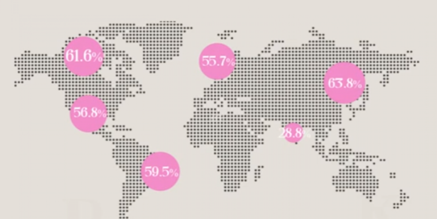
- If you look at the difference between men working and women working, there is a gap even in some of earth’s most-developed economies.
- Right now, women spend twice as much time on household work as men and four times as much time on childcare.
- And, right now, even across the world’s most developed economies, there is an average 15 percent gap in what men and women earn.
- A third of that pay gap is due to what the IMF calls “Occupational segregation and reduced working hours” suffered by women: that is known as ‘discrimination’ to you and I.
- When women are younger, the wage gap is small. But it grows steeply when they have children. This is the “motherhood penalty” — it is estimated at 14 percent across the OECD countries.
- The share of women CEOs in Standard & Poor’s 500 companies is 4 percent.
- In 27 EU countries, only 25 percent of business owners with employees are female.
- Women got hit harder by the most recent recession than men. In 2011, female unemployment in the United States continued to rise, even as male unemployment declined.
- We’re only hurting ourselves. Just by having as many women as men in the labour market could change the economy for good by boosting GDP.
- Only 20 percent of national parliamentary seats across the world are held by women. Half of the world’s population are women. But only one-in-five of the representation.
Simon Rogers, data editor at Twitter, is a data journalist, writer and speaker. He is author of "Facts are Sacred: the Power of Data" and creator of the Guardian Datablog.
This post originally appeared on Rogers' blog. It is published on IJNet with the author's permission.
Image: screen grab from video

