Visualizing data is a task no longer strictly resigned for data journalists — it has become an indispensable skill for all reporters.
Graphs and charts have been especially critical in coverage of the COVID-19 pandemic. They have featured prominently in the news as people around the world have sought information about the virus and its devastating consequences.
Given their importance in conveying potentially life-saving information during trying times, overlooking an element in your visualization could mislead or create panic among your readers.
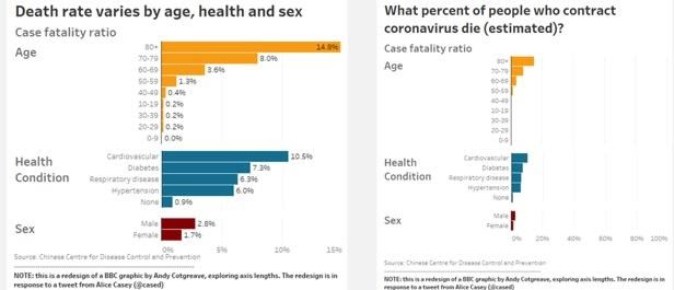
The BBC committed an error like this last March, when the outlet published a graph to illustrate variation in COVID-19 death rates, broken down by the victims’ age, health condition and sex. The reporters used a bar graph which, in ending the x-axis at a 15% value, gave readers the impression at first glance that all patients older than 80 die of the virus.
The intent, however, was to convey that 15% of those 80 years of age or older died of COVID-19. A Twitter user flagged this, and called on the BBC to amend the graph to avoid undue panic. Tableau technician Andy Cotgreave amended the visualization to better represent the data.

When done properly, data visualization can clearly and effectively communicate complex data to readers. Before publishing, reporters can also visualize numbers to help identify patterns and potential leads for their stories, ultimately leading to more cutting-edge analysis.
Journalists can visualize data to accomplish the following goals:
- Find facts and trends in datasets
- Clearly communicate complex data to readers
- Produce data-driven storytelling, complementing written or multimedia reporting elements
- Relay data in real time as events occur. Journalists have done this while reporting on the COVID-19 pandemic and the U.S. election, for instance.
- Provide data-informed forecasts and predictions
Importantly, reporters shouldn’t fixate on design aesthetics at the expense of presenting an accurate representation of the numbers at hand. Journalists can use different types of visualization, like maps, histograms and charts, to complement one another in providing more comprehensive storytelling, and more data-based stories overall. Especially during times of uncertainty, like with COVID-19, reliable facts and information are paramount.
Still, there are some common errors that data visualizers may commit, intentionally or not. These can work to serve a political agenda or manipulate a certain storyline, for example, and altogether misinform readers.
Here's how you can avoid them.
Don’t disregard graph axes
Disregarding the baseline of a graph is a common error. Line and bar graph axes should start from zero; otherwise, the graph can cause confusion.
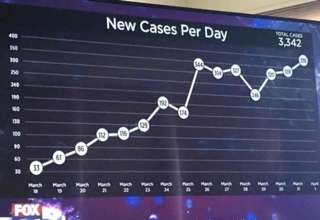
The graph below from Fox News showing COVID-19 infections has many misleading aspects. The y-axis doesn’t start from zero, and the values along that axis also do not progress consistently.
While the data may statistically be accurate, the way it is portrayed conveys an inaccurate understanding of the numbers. The graph was also published with no reference to the data source.

Avoid bias
Journalists shouldn’t pick and choose data to tell the stories they’d like to tell. Rather, the data should drive the reporting. Allowing bias to influence your data visualization is a dangerous error that can affect the information being communicated. For instance, if the numbers you’re working with show an increasing curve on your graph, that is the story that should be told.
Use appropriate visualizations
It’s important to utilize a graph that’s appropriate for the data you’re reporting. A pie chart, for example, can show data as percentages of a total figure. Maps, understandably, can best illustrate geography.
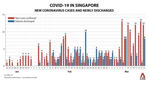
In the graph below, journalists have attempted to demonstrate a discrepancy between two indicators over time: new cases of COVID-19 and discharged patients. Unfortunately, bar charts aren’t well-suited for this type of comparison, and as a result the visualization fails to effectively communicate the information. A line graph would have been a more appropriate choice.

Don’t break norms
Reporters shouldn’t break accepted norms when visualizing data. For example, readers usually expect a dark color to reflect the highest density or value on the chart, in contrast with lighter color. Bucking norms like this might mislead readers.
Some colors have a direct mental connection to the audience. Red, for instance, can denote danger, while green may convey more positive information.
Be intentional with symbols, too, as they each have their own respective significance. Don’t use a sad face emoji in relation to positive news, for example.
Include only necessary visual elements
Journalists should avoid unnecessary add-ons in their visualizations. If an element of your graph or chart doesn’t help communicate the information then it will only serve to clutter or even mislead.
When done well, visualizations accurately and effectively communicate the data-driven story you’re telling. It’s imperative to spend the needed time to collect the data, analyze it, and identify stories within. Visualizing the numbers can bolster your reporting, and more comprehensively inform your readers.
Amr Eleraqi is an ICFJ Knight Fellow leading a training and mentorship program that is expanding data-generated storytelling in the Middle East and North Africa.
This article was originally published by our Arabic site. It was translated to English by Mohamed Bouhmid.
Main image CC-licensed by Unsplash via Scott Graham.


