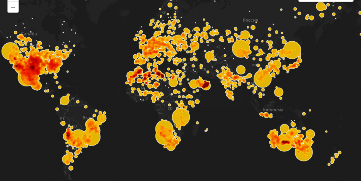
When a meteorite fell on Russia in February this year, surprising many in the city of Chelyabinsk and the rest of the world, several questions arose: How often does this happen? When was the last time a meteorite of that size fell on Earth? And where have other meteorites fallen in the past?
The Guardian data team rose to the challenge, and mapped every known meteorite that has landed on the planet. Using data from the Meteoritical Society, the Guardian initially used Google Fusion Tables to display the data, but ended up publishing a map made with the same data by the staff of CartoDB, one of the most powerful visualization tools available.
Since then, the meteorite map has been featured in HackerNews, The Verge and Digg, and it has become a success story for CartoDB, a cloud-powered database mapping platform that allows users to map, analyze and build applications with data.
Launched in April 2012 by tech company Vizzuality, based in New York and Madrid, CartoDB was created to make it easier and faster to work with geospatial data and big data. It allows users to create beautiful dynamic maps, like this visualization of 50 years of Rolling Stones’ concerts or this map showing Iceland contour lines.
And CartoDB wants to expand its target audience from developers to users with no coding experience who just want to map (and make sense of) geographic data. CartoDB is intended for developers and people who create mobile apps, "but it’s also for people who have geospatial datasets, and they want to create those visualizations and be able to really derive deep insights from whatever data they have,” said Jacek Grebski, former head of marketing at CartoDB and founder of Exversion.
CartoDB allows you to drag and drop data or upload a data set, do advanced styling with CartoCSS (a language specific to CartoDB but similar to CSS), perform queries with SQL and embed your map in your site or WordPress blog.
With almost 20,000 users, including news outlets like The Wall Street Journal, The New York Times and National Geographic, CartoDB is meant for any user with any skill. “You don’t need to know how to code to create a visualization,” he said.
Other popular mapping tools, such as Google Fusion Tables, also let users create visualizations from data, but CartoDB offers more firepower, Grebski said.
“Google Fusion Tables is not technologically as powerful as people had wanted. While they can render 100,000 points on a map, we are able to do millions. In terms of scalability and the volume of geographic data that CartoDB is able to process, it really makes the product stand out,” he said.
Version 2.0 launched in November and expanded the base maps from Google Maps to OpenStreetMaps, Mapbox and Nokia maps. It improved the sharing options and also added a new JavaScript Library, Cartodb.js, that makes it easier to create applications.
This open source platform has had a good run in the past few months: earlier this year the EU gave Vizzuality a grant of US$392,000 to map biodiversity and endangered species with CartoDB.
CartoDB follows a freemium model, offering a variety of plans: the free option allows users to upload up to five tables and offers up to 5 MB of storage space, while the priciest option costs US$149 a month and offers unlimited tables with up to 500 MB of space.
Although no coding is required, using CartoDB can seem a little bit daunting if you have no coding experience, especially if you want to take advantage of all the features the platform has to offer. But it’s not hard to get used to it, and tutorials on the site and on CartoDB’s blog make it easier to find your way through the platform.
Maite Fernández is IJNet’s managing editor. She is bilingual in English and Spanish and has an M.J. in multimedia journalism from the University of Maryland.
Image: screengrab of Every meteorite fall on earth mapped.

