
Figuring out how to measure media impact is becoming increasingly important. It is equally important to showcase it in a visually appealing way.
A few weeks ago, I worked with a classmate from my Global Media: Innovation and Economic Development course at Columbia University to research the media's impact on the Ukraine-Russia conflict one year after the 2014 annexation of Crimea. For this assignment, we used a few tools to measure the impact and present the data in a visually appealing way.
Below are some lessons learned about which tools were useful and effective:
Topsy
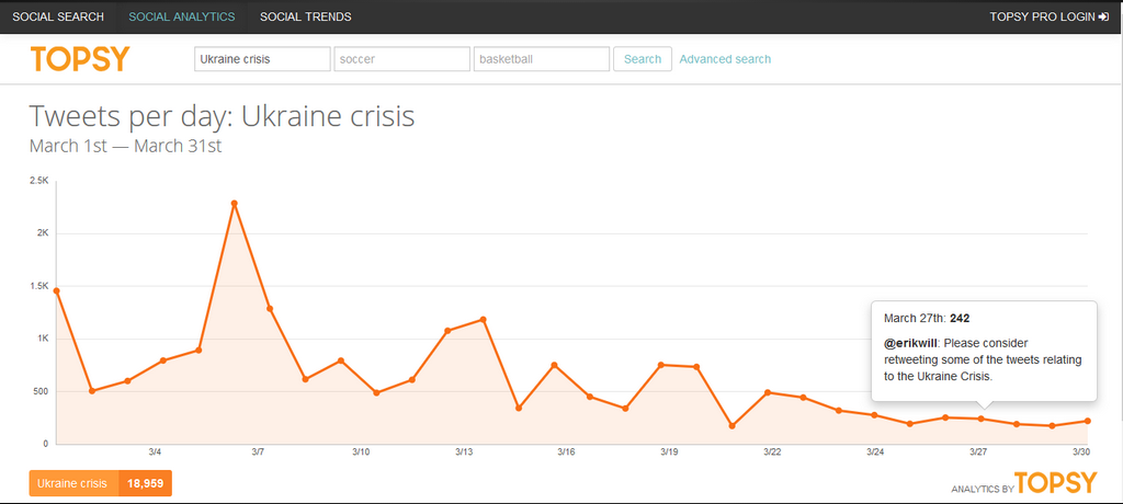
Topsy is a well-known social media analytics tool for quantifying and analyzing Twitter feeds.
Topsy was essential for gauging public interest in the Ukraine-Russia conflict, letting us create a graph that showed the rise and fall of interest in the conflict from March to April 2015.
The graph showed the most tweeted story for each day, which helped us determine which events piqued the public's interest.
There were also a number of limitations. While Topsy allows you to search as far back in time as you need to find particular tweets, you can only use data from the past 30 days to make a graph. Also, finding the most tweeted stories only works for data sets of a certain size. So we couldn’t compare top tweets containing the keywords “Ukraine Crisis” to the top tweets with the keywords “Crimea Crisis” or “Ukraine.”
NodeXL
NodeXL is a Microsoft Excel extension that allows you to create an interactive visual based on a social media feed. This extension is remarkably easy to use. You simply import data from a social media platform. (For my project, I used Twitter.) The tool then creates an interactive feed that shows how information is spread to users throughout the network, showing an interconnected series of “branches” that connects these users.
This tool also allows you to upload the image associated with a particular Twitter account to showcase an “informal network” between different news outlets. It shows how information is spread from one journalistic source — whether it be a particular individual or a major publication — to another. 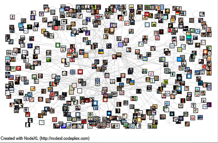
The extension contains a number of other useful features, one of which identifies the top distributors of a particular keyword, which allowed my partner and I to isolate the top two percent of Twitter users in our data set.
My only gripe with NodeXL is the potential run time of the extension. My partner and I had a particularly difficult time running the software on our older laptops. While this certainly wasn’t detrimental to our project as a whole, I can imagine that a journalist accustomed to multitasking might find the sizeable memory required by the program to be inconvenient. We analyzed about 500 tweets, but for users attempting to visualize larger data sets (the program allows you to implement more than 18,000), I would recommend that they use a computer with storage room to spare.
Easel.ly
Easel.ly allows users to create infographics. While NodeXL helped to show the interconnectivity of tweets between news outlets, a significant portion of the data given to us by the program (in our case the various countries that these tweets were coming from) was not expressed in the visual it created.
Easel.ly was particularly useful for this purpose. After manipulating the data and isolating Twitter feeds by geographic area, we were able to visualize tweets by the originating country, showcasing the global distribution of the Twitter community’s response to the Ukraine crisis.
To see my full presentation, click here.
Gabriel Guzman is covering the latest in journalism innovation worldwide as a class assignment for "Global Media: Innovation and Economic Development," a course offered by Columbia University's School of International and Public Affairs.
Main image CC-licensed by Flickr via Barbara Krawcowicz.