Journalists now have a free yet valuable guide to starting ambitious data journalism projects or discovering new tools to apply to their everyday work.
The recently launched Data Journalism Handbook is a collaborative effort from more than 70 contributors worldwide, including data journalists from ProPublica, The Guardian and The New York Times.
Billed as a useful resource for “anyone who thinks that they might be interested in becoming a data journalist, or dabbling in data journalism,” the book delves into how to obtain, process, analyze and deliver data.
IJNet took a peek and found these three data visualization tools to be a great starting point for journalists who want to experiment with data journalism:
- Tableau Public
This downloadable tool is useful for creating interactive data visualizations. It doesn’t require any programming skills and the free version has a limit of 100,000 rows of data in any single file.
Caveat: it only works with PCs, but a Mac version is in the works.
The website includes a long list of tutorials and free live training is also available.
- Google spreadsheet charts
This tool allows you to create bar or pie charts, maps, tree maps, etc., from a spreadsheet in your Google Docs account. It’s easy to use and works much like Excel charts.
For a step-by-step tutorial, check out this post.
- Piktochart
This freemium web application allows you to create cool infographics in little time. The free version offers three templates to choose from and users can customize and add elements by dragging and dropping.
Setback: the free version only allows you to download the infographic as an image. The pro version ($14.99 a month) offers you more templates (over 30) and the option to download the infographic as HTML or raw data.
Other useful tools featured in the “Data visualization DIY: Our Top Tools” section include Google Fusion Tables and Many Eyes, featured by IJNet here and here.
A web version of the book is available for free under a CC-license here. You can also purchase a hard copy here.
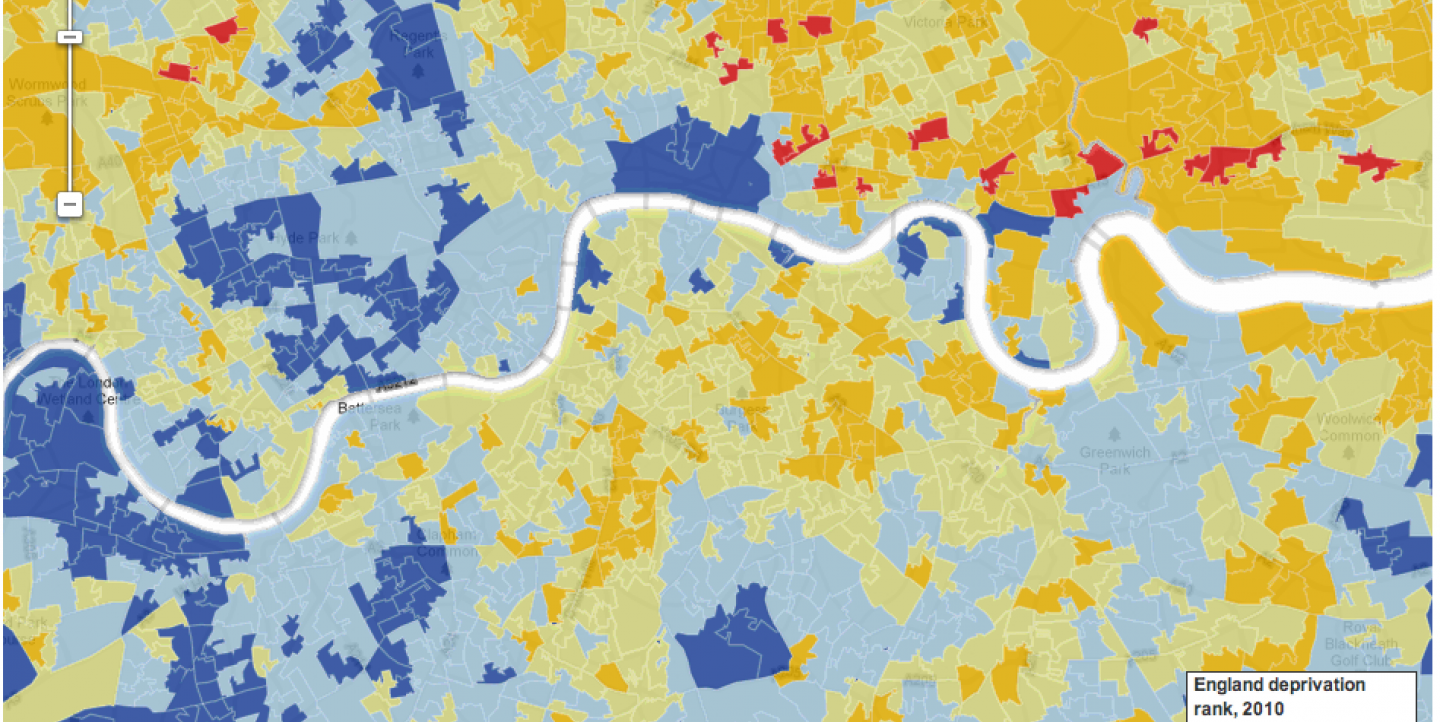
Image: The poverty and deprivation map of London, created by The Guardian using Google Fusion Tables.

