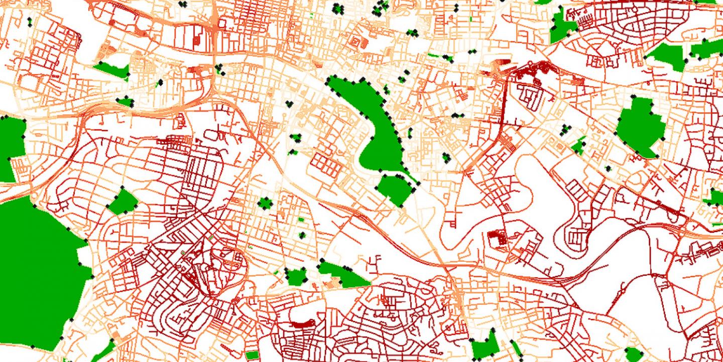
Modern data sets are often best displayed in an age-old format: the map, according to Brazilian environmental journalist and media trainer Gustavo Faleiros.
Most data sets contain location-related information that makes them good candidates for mapping. “Maps are also a great tool for allowing user interaction,” said Faleiros, “and just a great way to tell stories.”
In 2012, Faleiros, as part of his Knight International Journalism Fellowship, launched InfoAmazonia, a news site and mapping platform that uses satellite and other publicly available data to monitor the Amazon rainforest.
Last week, he led a Google+ webinar which covered basic info on mapping for journalism. Participants learned how to acquire data from primary sources, transform it into a display-ready format and map it with the right tools. The webinar, hosted by ICFJ Anywhere, was supported by Dow Jones Foundation.
Here are IJNet’s key takeaways from the webinar:
There's a wealth of available data
“Journalists and data visualizers cannot complain about the lack of sources on environmental issues,” Faleiros said. Decades' worth of data are available thanks to scientific research and observation, and the data sets are usually accessible in open formats.
Faleiros created the Geojournalism Handbook to help journalists tap into sources of geodata. The handbook includes information on how to access environmental data on everything from forest fires to greenhouse gas emissions. It also offers tutorials on how to manipulate, map and visualize these data.
There’s no one-size-fits-all map
Journalists can choose from a number of different mapping formats, which offer a range of visual possibilities. Among them:
Point maps display multiple points across a region. For example, each point on this map represents a water source in Tanzania.
Similiarly, polygon maps use shapes to represent the data in a geographic region. A good example is this Texas Tribune map, which displays the disposal locations for the state's wastewater, often from hydraulic fracturing operations.
Cloropleth maps use color-coded polygons, and are useful when looking at trends. This cloropleth map of C02 emissions, for instance, uses red where there are more emissions, and green to show where there are fewer emissions.
A heat map represents data as colors, or “heat.” You can view an example here.
A bubble map displays each data point as a circle whose size is scaled according to its value. This bubble map shows population by U.S. county.
- Cartogram maps distort geographic forms proportionate to the data being represented.
Tools to check out
From Google Spreadsheets to Fusion Tables to CartoDB, a number of tools are available to manage, analyze and display sets of data in map form. Faleiros has compiled this list of tools, which tells the advantages and disadvantages of each tool, and gives examples of how each can be used.
He also provided an overview of how to use Jeo, the WordPress theme which powers InfoAmazonia and other geojournalism sites. The Jeo platform makes it possible for sites to publish news stories as layers of information on digital maps.
To make maps online, Faleiros recommends that journalists familiarize themselves with a number of formats and skills for handling geographical information, including CSV, XLS or any Table format with latitude-longitude columns; KML/KMZ formats used by GoogleEarth or Fusion Tables; SHP (Shapefile) folders and GEOTIFF. They should also know how to “geocode,” or to locate information using tools that read geographical information automatically.
Try a few practice exercises
For practice working with different formats and tools, Faleiros provided exercises on making point and polygon maps with KML; making point maps with CSV; using Google Fusion Tables; and using Google Earth to create 3D visualizations.
To view the recorded webinar, click here. To access the webinar presentation, click here.
Image courtesy of OpenStreetMap contributor macrofight under a Creative Commons license.
Jessica Weiss is a Bogotá-based freelance journalist.

