The COVID-19 pandemic pushed the world into a fast-paced, endless cycle of emergency after emergency. The public and journalists alike had to focus on the latest news, which was perhaps unavoidable. This came at a cost: It made it difficult to see the forest for the trees, and gain a comprehensive view of what was unfolding.
Data journalists felt this as they constantly reported the latest numbers around the pandemic. Rarely could they take a step back and think about the pandemic in a more systematic way. This is why we launched The Great Wave.
The Great Wave is a data journalism project that I started during a year-long fellowship I held at the International School for Advanced Studies (SISSA) in Trieste, Italy, a research center that focuses on physics, neuroscience, mathematics and science communication.
As the project lead and a visual journalist, I thought it was the perfect chance to take a break from the emergency writing about the pandemic we’ve all been dedicated to for almost two years now. My team and I wanted to take a broader look at what happened in 2020, focusing on the best available evidence.
[Read more: How to report on the potential side effects of COVID-19 vaccines]
We sifted through hundreds of scientific studies to report the ones that better showed what we have learned so far. We also talked to dozens of experts who guided us through the uncertainty of the many things we have yet to fully comprehend, from Long COVID to the virus’ effects on mental health.
Working with SISSA’s data science department, we found ourselves working with large amounts of data in some cases. It was important for us to display the numbers in a simple way — our process was rigorous, but we wanted the data to be accessible to non experts, as well. This is why data visualization was a key feature; it can help us understand many aspects of the COVID-19 crisis.
We partnered with information designer Federica Fragapane, as we sought to humanize our data. From the start, we decided that our data visualizations would need to show that we were talking about actual people and their stories, not just abstract figures. We spent a significant amount of time figuring out which designs would better serve this purpose, and settled on the following.
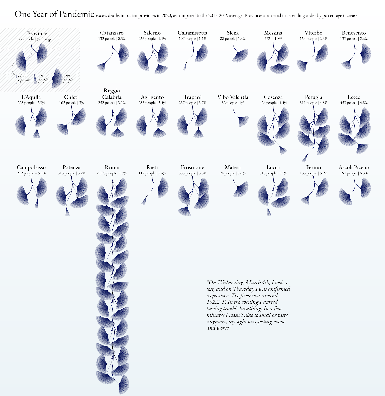
Our hope was that numbers wouldn’t make this project any less about people.
The project explores the beginning of the pandemic, from the first documented cases to the large outbreak in Bergamo, in the Lombardy region of Italy, showing the effects on people’s physical and mental health, the economy, and society at large.
It also allows readers to see all the various pandemic responses at a glance: What did we think about the virus? Was that right? In many large Western countries, policies were focused on containment and lockdowns, while officials based their public health measures on the assumption that SARS-CoV-2 behaved like flu viruses. When it became clear that the virus was in fact very different, however, policies took a long time to change, and in many cases they never did. Data visualization helped us learn that, too.
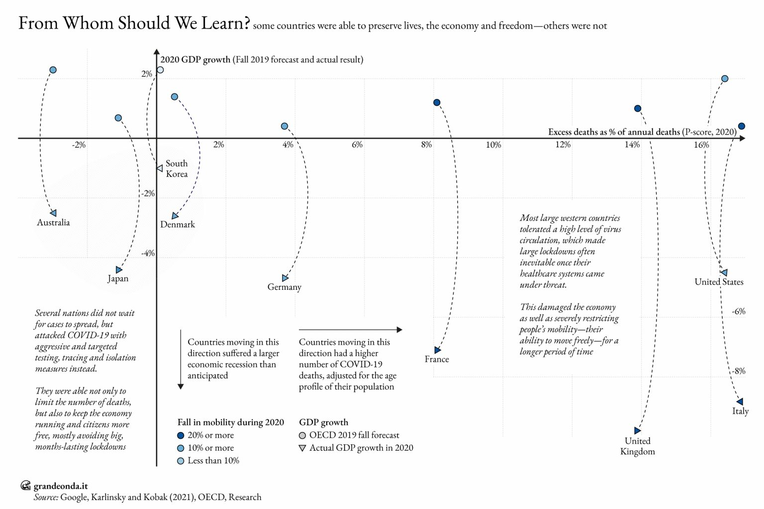
Other countries — many of them in Asia — were able to better understand how SARS-CoV-2 behaved from the beginning, and acted accordingly. In mid-January 2020, Hong Kong residents were advised to avoid crowded places with poor ventilation, for instance. Meanwhile, other countries in the West took months to accept that the virus could be airborne.
Also in January of that year, factories in Japan started producing surgical masks 24 hours a day. On the other side of the world, people were advised not to use them, and in some cases even turned them into a political battle. Advanced contact tracing and the use of tracing apps didn’t readily take hold in the West, while in countries like South Korea and Taiwan, among others, their use helped identify and isolate chains of transmission.
[Read more: Tips for reporting on vaccines, hesitancy and misinformation]
The end result of the approach followed by many European nations and the U.S. led to some of the worst possible outcomes: high numbers of deaths, crippled economies and often the need to strictly limit individual freedoms to avoid the collapse of healthcare systems. Countries that were able to better follow scientific research and adapt their responses to it suffered many fewer deaths and severe illnesses, and they weren’t forced to close their economies or restrict individual freedoms as often.
The results of our project were featured in national and local media in Italy, sparking debates around the timing and effectiveness of the country’s pandemic response. Some public health authorities denied our FOIA requests, and the lack of transparency around critical epidemiological data was also one of the most contested issues.
This process taught us that many important features of the pandemic could only be seen by taking a few steps back. A year-long project is rare, but it was necessary for us to better understand a crisis of this magnitude. Too much attention to the everyday news being published made focusing on the bigger picture more difficult. Visual journalism helped us grasp it.
Photo by Jakayla Toney on Unsplash.
Read more articles by