
The data journalism community is growing fast in Asia. You may have come across compelling projects from the graphics teams at Caixin (China), Readr (Taiwan), Rappler (Philippines), Malaysiakini (Malaysia), or Apple Daily (Taiwan). For this article, we decided to take a closer look at one of the biggest players in the region: South China Morning Post.
They've been doing some incredible work over the past few years, which got them over 100 international awards on four continents.
Darren Long has led the SCMP graphics team’s transition from print to digital since 2014. This year, he joins over twenty international experts as jury member of The Sigma Awards, a new data journalism competition sponsored by the Google News Initiative and hosted by the European Journalism Centre’s DataJournalism.com.
In this interview, we talk about the state of data journalism in Asia, the relationship between graphics and data, and what data journalists can learn from the SCMP’s graphics team.
You come from a design background but many of your projects at SCMP involve data and information. How did you get into data journalism? What were some of the challenges you faced in that transition and how did you overcome them?
Darren Long: I believe an outside perspective has helped me in my role. I began my career almost three decades ago as an illustrator but pivoted to art direction to bridge what I saw was a disconnect between words and visuals. My biggest challenge when I became SCMP graphics manager five years ago was making that shift to digital from print. While print is my first love, I get all my news on the phone, and I realized we needed to give our readers the chance to enjoy our work on their phones. That meant a seismic shift in the way we worked, not just technically but also aesthetically, in making sure our work had as much visual power on a tiny iPhone screen as it did on a broadsheet news page.
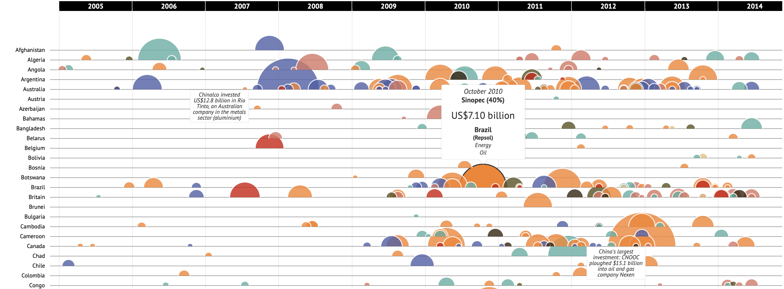
It was a work in progress. In our earlier days of that digital transition, we created graphics that were essentially a matter of putting our heavily research print work online. One example was our study of China’s overseas investments where we show every overseas merger and acquisition with a value above US$100 million made between 2005 and 2015.
These kinds of graphics were cool but not good enough for the phone.
We added some new blood and the team worked together to learn code. We began to think about how we could make our visual stories evolve over time, rather than telegraphing the idea to readers with a single image. Breakthroughs came in the form of Lightning in Hong Kong and The five main projects of the Belt and Road Initiative when we realized scrolling online meant more room to develop a narrative.
How would you define the state of data journalism in Asia today? How is it different from other regions like North America and Europe?
Press freedom is an issue in Asia. Remember the Reuters journalists that were locked up in Myanmar? And Maria Ressa of Rappler who the Philippines’ President is using the pretext of tax evasion to persecute? Asian data visualizations tend to avoid sensitive issues and are less about holding governments to task than in the West.
Data is our biggest challenge.
Even with all the freedoms we are fighting to keep in Hong Kong we still find it hard to get reliable data on China. Singapore, for all its censorship of the press produces some great stuff. The Straits Times, for instance, produces quality interactive pieces such as Guide to the #haze in infographics.
There are other great visualizations coming out of Asia. In South Korea, Sung Hwan Jang has some awesome infographics on his website 203 × and my friends at Kompas, a newspaper in Indonesia are doing some terrific work. I love their news article, Rentetan Senja Mencekam di Gelora, and their culture pieces such as Makam Unik Orang Toraja — Tutur Visual, and environmental interactive Kupu-kupu Bantimurung — Tutur Visual, which involves finding five rare butterflies.
Even in China, where the internet is highly censored there are some lovely pieces being developed by Caixin 财新|博物馆里的国家宝藏 and The Paper 我们“熔”掉2055件垃圾,得出了全网最全垃圾分类可视化 美数课 2019–06–28 72 . Sixth Tone is also proving itself to be innovative with pieces like Hu Line: Journey through China’s heartland.
The data-driven projects produced by SCMP are very different from other publications known for data journalism because your team puts a lot of efforts in the visuals and designs. How do you see the relationship between graphics and data? Do you think graphics come before data/information?
I believe data comes first and the visuals are informed by the data. It’s the same with page design: you wouldn’t select photos and lay a page out without reading the story.
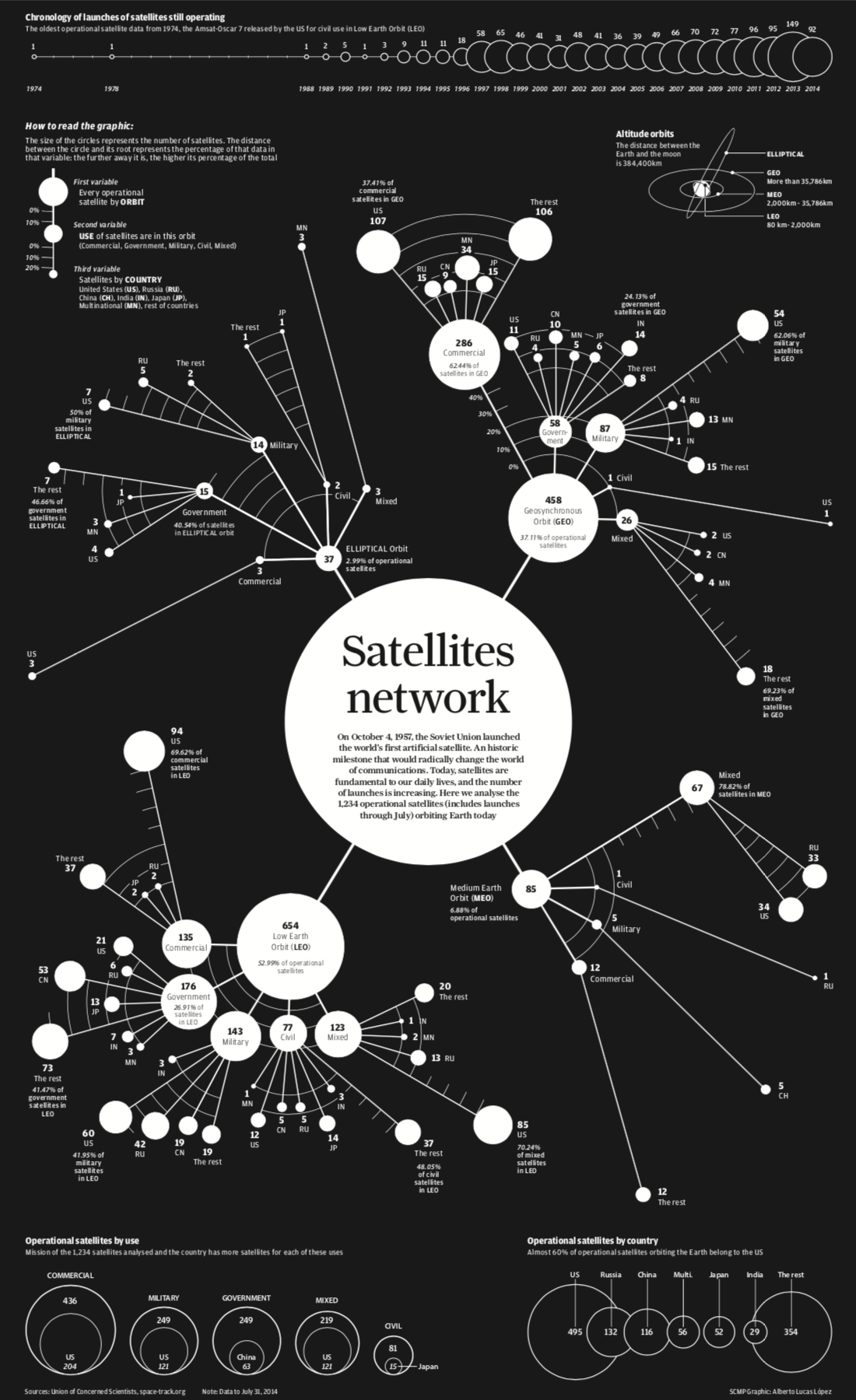
Perhaps the visual aspect of our stories are sometimes so striking, such as “Satellites network” (pictured above) that people don’t realize the visual was designed out of the data.
How China’s ‘reform and opening up’ transformed poor families into middle-class shopper Even How China’s ‘reform and opening up’ transformed poor families into middle-class shoppers was based on studying the data before we came up with the concept.
Our graphics team is mostly from print backgrounds, which means interpreting data does not come naturally to all of us. We use this to our advantage because we need to think visually to understand the information ourselves before relaying it to readers.
2017: the safest skies record is a great example of Adolfo Arranz being inspired when he heard the news. He immediately wanted to show many flights had taken off and how few had crashed. The concept came to him in a eureka moment, but working out how to communicate it took a couple of days.
Can you walk us through the typical workflow and timeline to produce a data journalism project at SCMP? How big is your team and how does it collaborate with other editorial desks?
Everything we do starts with research and a pencil and paper for sketching ideas. It’s all about ideas. The graphics team consists of 11 people with eight different nationalities and varied backgrounds (fine arts, design, journalism, computing). Five designers concentrate on several longtail graphics simultaneously, while another five work on daily news and opinion-editorial illustrations. We have one engineer who helps all of us. My role is like the conductor of an orchestra. It looks graceful when everything is in tune but if an instrument goes off tempo the buck stops with me.
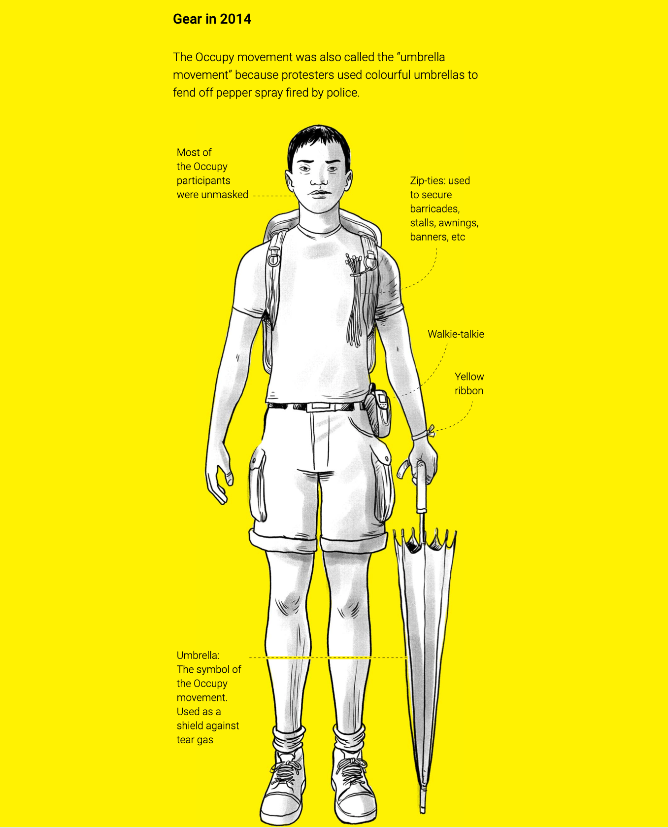
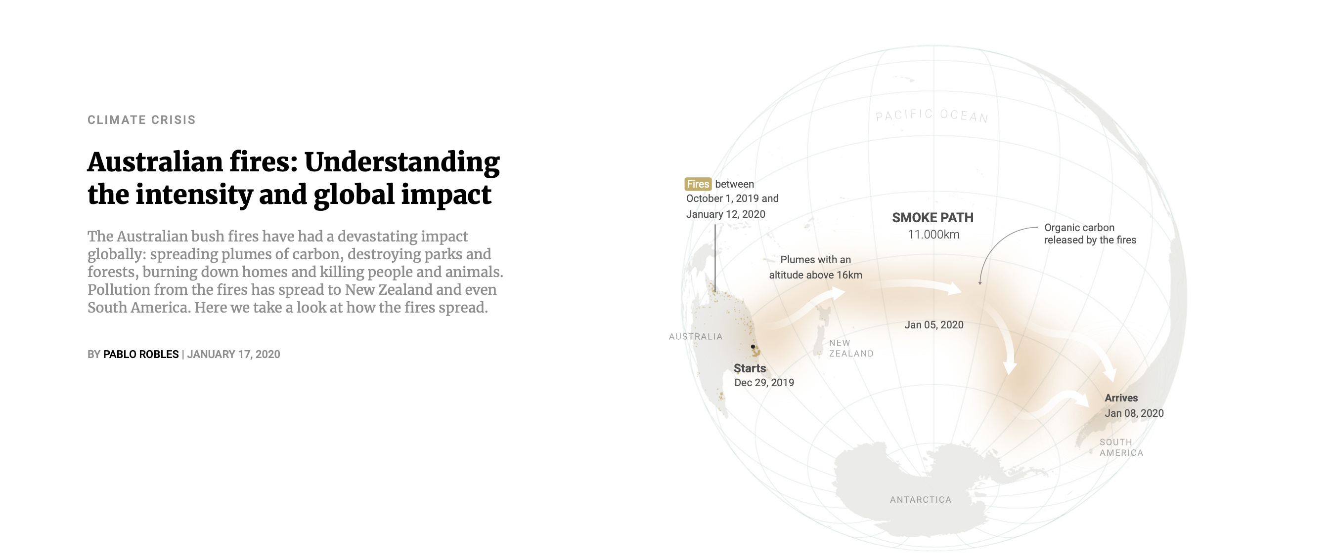
Most of our infographics are self-initiated but we also collaborate with other desks especially if the story needs specialized reporting. For instance with the recent protest graphics, Pablo Robles conceived 100 days of protests rock Hong Kong as a way to show the levels of violence afflicting Hong Kong. Research, reporting, text, editing, graphics, videos animations etc were all done by the graphics team. Whereas the words for From Occupy 2014 to protests 2019 (pictured above) were provided by a staff reporter while we came up with the visuals and conceptual timeline.
Last year’s MIC2025 visual stories series was challenging as it involved different parts of the paper. The hardest part about working with other teams is that they tend to look for data to support a preconceived notion whereas we want to explore the data first, then visualize it before finding a story and we want to leave readers free to draw their own conclusions.

The ideas come first and the technology is there to facilitate us to communicate the idea so production times vary widely. The Wuhan virus: a visual explainer (pictured above) was put together in a matter of hours, while the The history of the Forbidden City series was almost two years in the making. But that was an extreme case that involved travelling to Beijing and Taipei.
Typically a data visualization like The top most competitive cities that are changing the world takes about a week.
How can other data journalists learn from you and your team at SCMP?
It’s all about having fun, isn’t it? Marcelo Duhalde’s story which readers can use to compare their height to world leaders I am as tall as … always makes me smile.
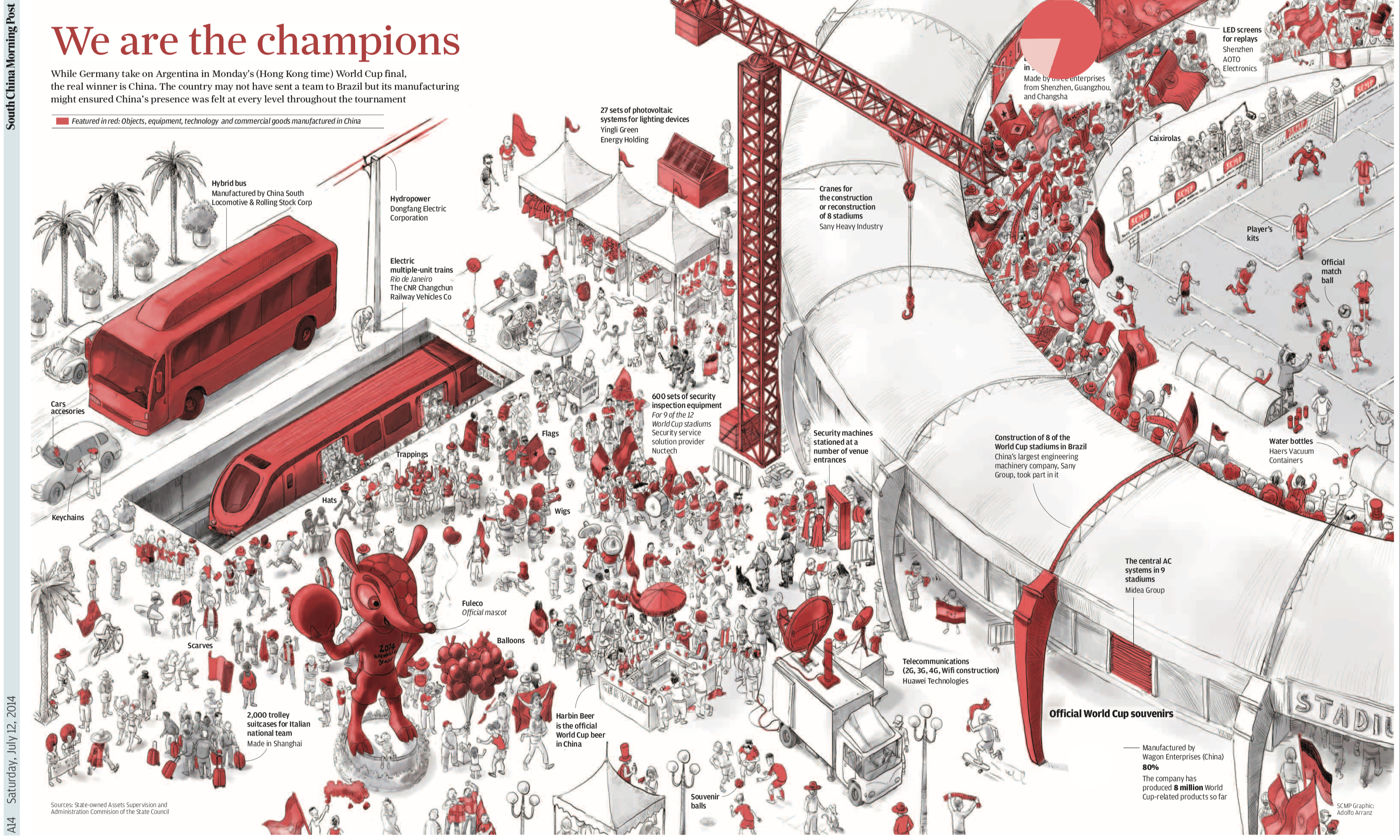
We try to be counter-intuitive and look for unusual angles. Adolfo’s piece on China failing to qualify for the world cup (pictured below) didn’t prevent them from being the ultimate winners in Rio thanks to all the business contracts they won.
And Dennis Wong’s infographic “Great size and great ambition” about China’s largest telescope saw him dumping the pride of the nation in the Hong Kong harbor to make a size comparison.
The Sigma Awards is a new data journalism award which aims to not just celebrate the best data journalism around the world, but also to empower, elevate and enlighten the global community of data journalists.
Entries to the competition are now open and data teams from around the world have until 3 February 2020 at 11:59pm ET to enter via this online form.
Marianne Bouchart is the founder HEI-DA and manager of The Sigma Awards.
This article was originally published by Marianne Bouchart on her Medium page. It was republished on IJNet with permission.