When Election Day 2012 results began pouring in at warp speed, newsrooms were armed with tools for mapping the mayhem.
As the election frenzy was winding down, The Washington Post, USA Today and local news organizations shared their mapping strategies at the GeoDC Meetup: Election Mapping during Digital Capital Week event, which IJNet attended.
At the Washington Post, developers worked closely with political reporters to create maps packed with context. Since election results unfold at a fast pace, there's no time to analyze the results on the spot. A map is a success if "when a state is called, if the numbers go through and if the maps change," said Post graphics editor Emily Chow.
Developer Stan Wilson of USA Today stressed the cardinal rule: "Don't break on election night. Make sure you maintain stability on a new application."
Once reporters have a chance to reflect on the influx of data, embeddable widgets are in high demand, Chow said. Political reporters want to feature the maps in their stories so readers don't have to leave the page to view a graphic.
The Post switched this year from Google Maps to Leaflet, an open-source library for interactive maps. Leaflet offers a more seamless visual in projection maps, like this one on presidential campaign stops.
USA Today worked with MapBox to create streamlined maps to complement the outlet's redesigned website.
Simple red-and-blue maps don’t show the relative importance of the states for the election count, said MapBox developer Dave Cole. He helped create maps like the Electoral College map to give a more accurate representation of each state's sway.
On election night, USA Today received updates every seven minutes from the Associated Press. Developers transformed and stored the updates in a database, exposed the information through an application programming interface (API), and each viewer's browser created the actual screen visual.
Evan Caldwell of geographic information system (GIS) company Esri worked with local news station WJLA to implement Python-coded interactive maps to cover the presidential election and visualize the Maryland and Virginia election results.
First used as a crowdsourcing tool to engage the community, the station's interactive maps brought in about 50,000 views for its Hurricane Sandy coverage and more than 80,000 views on election night, Caldwell said.
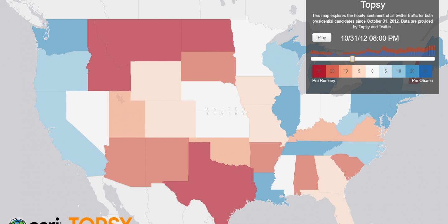
Esri used content tracker Topsy to create an election sentiment map capturing data from Twitter. Every time someone from a specific state mentioned something positive or negative about Obama or Romney, the map changed shades to reflect the emotional shift. You can watch how sentiment unfolded from Oct. 29 to Nov. 6--in just one minute.
Want to build your own maps? If you don't have coding skills, try Google Fusion Tables. WYNC uses it simply but flawlessly.
If you have a few coding skills, check out open-source site Leaflet. If you're a developer (or just working with one) check out MapBox and Esri. Both are free with the option to upgrade for greater flexibility and control.

