
Data about rainfall can hold a treasure trove of stories for environmental, business and, increasingly, political journalists. But news of an incoming drought could cause stock markets to tumble in countries where agriculture is the mainstay of the economy. Across the globe, several governments treat climate data as a national secret, either completely restricting access to it or parting with it in return of a fee high enough to cause journalists and researchers to back off.
But in this time of unprecedented climate breakdown when rainfall patterns are affected around the world — which in turn affects the availability of water on the surface — access to climate data is more necessary than ever.
An application called NOAH visualizes two sets of climate data for journalists and researchers to access. One, about changes in surface water. And another that examines changes in rainfall patterns around the world.
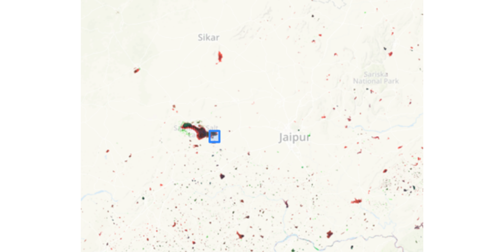
To see the first set of data one has to simply zoom in the map of the globe on NOAH. Areas highlighted in red on the map indicate water bodies that have dried between 1984 and 2015. Green indicates areas that have become wetter and the black shows those water bodies that have remained the same size.
NOAH can be used to find areas where water bodies have dried up, and can act as a starting point for further research. The data can lead environmental reporters into stories, and researchers into new lines of inquiry.
For instance, in this story from India’s desert state Rajasthan, NOAH was used to establish how a large number of water bodies in the area had gone dry.
The second set of data on NOAH is about rainfall anomaly. NOAH allows users to click on any place on the globe to get figures on how much the rainfall has deviated from the norm in that particular location. The graph that is generated can be downloaded in a .PNG format and used as evidence to inform interviews on the ground.
The graph below, for instance, established that rainfall in Ajmer city in western India was becoming more erratic.
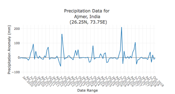
The data helped support interviews with the farmers who spoke of erratic rainfall and its impact on their livelihoods. NOAH is already helping journalists in India, where large areas are facing a severe water crisis, to better cover the drought.
The monthly rainfall data dating back to 1978 that NOAH uses comes from the National Oceanic and Atmospheric Administration (NOAA) Climate Prediction Center’s Climate Anomaly Monitoring System-OPI.
The global surface water data is courtesy of the European Commission’s Joint Research Centre. Using three million Landsat satellite images, a four-person team at the Centre quantified the changes in global surface water between 1984 and 2015. The team published their findings and analysis in Nature in December 2016.
Data journalists that are a part of team NOAH then used this data set and presented it in a form that would be easy to understand for the lay audience.
You can access the original data set that NOAH uses here. Or write to team NOAH with questions on how to better use the data in storytelling.