
Why? Well, it depends if you actually want anyone to see it.
It’s been happening for a while but really matters today as smart phones become ever more ubiquitous — now over 65 percent of the US market — and more and more people now access the web with their phones.
But what does that mean for data journalism?
It also depends on what you’re producing.
It’s become apparent that mobile is still often seen as the relation of desktop, which is understandable on one level: the rewards for designing for desktop are so high in terms of space but so much lower than mobile for engagement. The issue was raised by my former boss, colleague and fellow Data Journalism Awards judge Wolfgang Blau, who points out that many developers either don’t have the inclination or the capacity to test their interactives and apps on every device out there — and that represents a lost opportunity.
“Not only are readers shifting towards mobile, but smartphones also provide us with a range of new ways of interacting with data visualisations. I am still looking forward to journalistic data visualizations that use standard features of smartphones such a swipe gestures, the gyroscope, 360 sweeps like in the app starwalk, location awareness beyond simple geolocation, vibration etc.
To make the exploration of data visualizations more informative, engaging and enjoyable, I hope, we will see more journalistic data visualizations that go far beyond simply making desktop interactives readable on mobiles but that turn the tables and primarily develop for smartphones and have a rendition for desktop. not always, but why not sometimes?”
News organization CMS often mean that mobile web versions of traditional websites strip out essentially all the interesting stuff: charts, interactives and iframes often vanish in mobile versions that are the same across an entire news site, with few concessions for mobile.
It obviously poses challenges: will readers take on a 1,000-word data analysis on a mobile? Will they want to explore a detailed analysis as opposed to a — much more shareable — static visualization? In my day job I know that Tweets with images are around 50 percent more likely to be retweeted, for instance. Added to the fact that a simple static viz can go viral is that it doesn’t necessarily matter how polished they are.
Take the Twitter feed of @MatthewPhillips (HT to @losowsky for this) who regularly posts simple charts, many of which are just screenshots. It’s effective instant data journalism and it works regardless of the platform you’re consuming it on.
But for bigger operations, the challenge is how to combine that instant, platform-friendly approach with the beauty and elegance of the desktop visual output, whether or not you have the resources of the bigger news outlets.
It’s not enough just to visualize the data now; you have to think hard about how it will be seen too. But that’s still a long way from taking specific advantage of the way that smartphones work now.
Here’s how a selection of data journalism sites line up on mobile. What do you think they could be doing better? Let me know in the comments below or on Twitter.
ProPublica
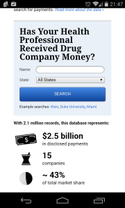
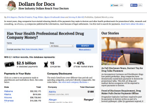
Assistant managing editor Scott Klein says all of his team’s apps work on mobile and have done since 2011. “All of them are responsive/adaptive,” he says, “with breaks for smartphone.”
This is how the team’s famous Dollars for Docs analysis looks on Mobile:
And this is how it looks on web:
Guardian Data
Interest declaration: this is my old site. Traditionally, the mobile version stripped out all charts, embeds and tables. Latterly, it defaults to the web version on my (Android) phone, and looks like this, which is identical to the desktop version but loses a bit of functionality with the screen size:

The mobile app does show interactive elements, and with the overhaul coming now it will be interesting to see how it develops.
538
Like the Guardian, 538 is almost identical on mobile — you would be hard-pressed to notice the difference, although the table on this article about commencement speeches is hard to read on small screen:

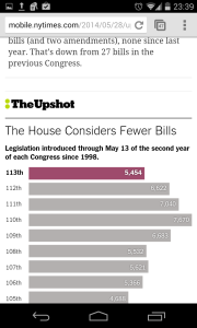
The Upshot
The New York Times has worked well on mobile for a while, and The Upshot is identified by Emily Bell as a particularly effective mobile display of data journalism.
Simon Rogers, data editor at Twitter, is a data journalist, writer and speaker. He is author of "Facts are Sacred: the Power of Data" and creator of the Guardian Datablog.
This post originally appeared on Rogers' blog. It is published on IJNet with the author's permission.
Image: CC Licensed on Flickr via Johan Larsson.