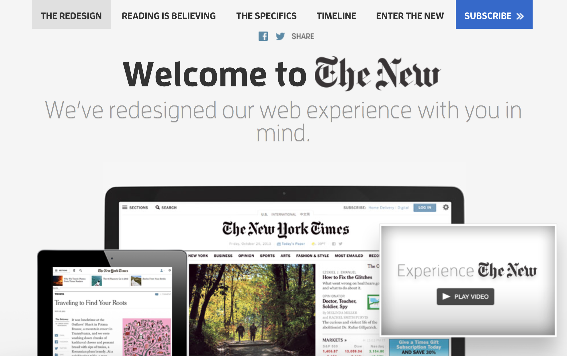
If you’re a journalist interested in the evolution of digital news, you’ve probably read a lot of posts by organizations explaining why they’ve redesigned their sites. (In fact, in honor of its own redesign, IJNet has one too.) Every post offers an introduction to the “newness” of the website and assures audiences of one thing: All the stuff you love is still available.
Redesigns can be unpredictable, untimely and gargantuan, but there are certainly things to keep in mind as you or your news outlet try to overhaul a website. Below are some lessons learned from major news organizations as they’ve undergone huge web transitions.
Don’t take too long to change.
A common theme that arose in redesign announcements was, “The amount of content on our site grew, but the backend didn’t.”
In a letter to Slate.com users in September 2013, editor-at-large David Plotz said the site’s makeover was the most “comprehensive redesign in nearly a decade.” Years ago, Slate simply had less content. Now, Plotz said, they run 14 blogs in addition to an increased amount of daily content.
Although The New York Times has made tweaks to its website, the last visual redesign occurred in 2006 — and, as it’s important to note, the project focused on front-end looks. But in January 2013, The Times debuted a changed site.
Reed Emmons, the director of web development for The Times, took to the Open Blog to explain how extensively the team had to overhaul NYTimes.com.
“It’s rare to have the opportunity to start from scratch on a site like the NYTimes.com, and when I say scratch, I don’t mean just a design refresh, but a complete reinvention of the entire digital platform,” Reed wrote. “We decided to re-architect the client- and server-side in order to accommodate new product, design and newsroom requirements, such as faster performance and responsive layouts.”
Everyone is on their phone or tablet, so think responsive.
Hard Candy Shell, the design and digital strategy company that revamped sites such as The Wall Street Journal, Newsweek and Slate, puts it pretty bluntly: “Being on mobile devices isn’t the future, it’s table stakes at this point.”
When Atlantic Media reinvented The Wire (formerly known as The Atlantic Wire) as a standalone site, former editor-in-chief Gabriel Snyder noted that 40 percent of The Wire’s audience used mobile devices to access the site.
“The change to the site I’m most excited about is our fully responsive design that allows for a seamless experience no matter the device — desktop, tablet, or phone,” Snyder wrote in his post to readers. (The Wire will now be folded back into TheAtlantic.com.)
Don’t call it a redesign.
Or, at least, don’t think of it as a redesign.

“Midway through the [redesign] process, we sought to avoid referring to the project as a redesign at all,” Bob Cohn wrote in November 2012 when he served as the digital editor for The Atlantic. “That seemed to trivialize it, suggesting a facelift or a fresh coat of paint. The goal, we realized, was more strategic than aesthetic.”
The Atlantic didn’t necessarily take too much time to change its look - the company redid TheAtlantic.com front page in 2010 - but it needed to address functionality and how social media plays into a news article.
The lesson learned from Cohn? Make sure it looks good, but make sure it can handle your growing content and the expectations of your online readership.
Be open to user-feedback.
While major news outlets usually do beta testing with select groups, there are still bound to be bugs and confused users.
After a major washingtonpost.com redesign hit the web in 2011, former managing editor Raju Narisetti held a live Q&A for users to offer praise, ask questions and voice complaints. Narisetti heard a lot of complaints. No one could find their favorite blog, the dropdown menu they were familiar with or links to chats. Despite all the frustrations, Narisetti answered all participants questions with step-by-step instructions on how to navigate the site. (Meanwhile, The Post — like many other news sites — had a special page dedicated to explaining every change made to the site and where users could find things.)
Via its Public Editor Journal in the opinion section of NYTimes.com, The New York Times dealt with plenty of user problems too.
“I’ve seldom had as much response to any post as to one earlier this month – from the first day of the redesign of The Times’s website,” public editor Margaret Sullivan wrote in January 2014, “ about 1,000 comments on this blog, in addition to hundreds of emails to my office.”
Sullivan proceeded to explain to users how to fix the problems they were having and provided screenshots of the website along with arrows pointing to where the person should click.
Main image CC-licensed on Flickr via European Parliament.

