Numeracy, or numerical literacy, is at the heart of data journalism. And if you are the kind of person who wants to become more numerate in order to do data journalism (maybe you’re a designer? A student? An inquisitive citizen?), one way to start is by thinking about a horse.
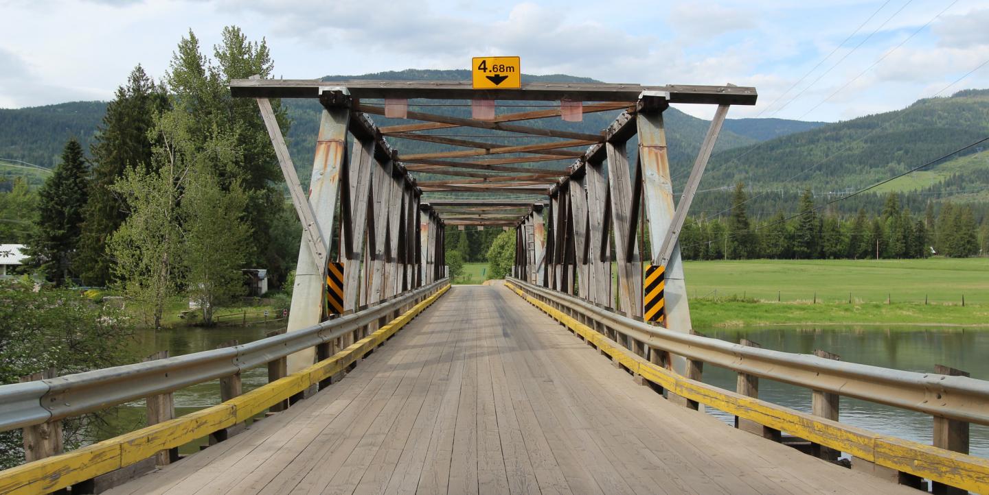
Specifically, I’d like you to imagine a large horse and rider facing you at the opposite end of a small wooden covered bridge, which is a situation I confronted recently in the woods near my house in Philadelphia. The horse was huge. The bridge was small and rickety. Could the bridge collapse from the weight of a horse and rider and a hiker? I didn’t know. I waited politely while the horse and rider crossed the bridge to my side.
Gephyrophobia aside, bridges do collapse because gravity. One part of a bridge collapse story is human: who got injured, who they were, and so on. The other side of the story is informed by data. Bridges are part of infrastructure, and infrastructure is inspected. There’s inspection data on every bridge — or there should be (in part, to prevent bridges from falling down).
Anything that is inspected is a potential source for a data-rich story. Finding opportunities to tell data-driven stories is the first step toward numeracy.
Data can answer some questions, but not all questions
Let’s say you want to do a story prompted by your thoughts on horses and bridges, and you are (happily) not reacting to a local collapse.
Your first step is getting the data. Bridge names (a.k.a. codes) and inspection data (including structural evaluations and other inspector-ish terms) can be found in the U.S. Department of Transportation’s Federal Highway Administration National Bridge Inventory database. You could FOIA the database, but the absolute easiest way to get your hands on this is to order it from the IRE/NICAR Data Library. The IRE database will include fields showing the year the bridge was built, how many lanes it has, and other fields that you can use to identify subjective indicators of overall bridge quality. It will include data from 2004 to 2013, and NICAR has data available from as far back as 1994. An IRE membership also comes with all kinds of helpful tip sheets on how to do data-driven stories.
The next step is asking the data questions. People call this interrogating the data, or using data as a source. You should keep in mind that data is dumb; you can only ask it certain kinds of questions.
In my data journalism class, students often begin by asking questions like “are people who ride horses more likely to die in bridge collapses?” Answering this question would require us to calculate a correlation, a mathematical expression that attempts to quantify the relationship between two things. DO NOT TRY THIS! Numbers people will be quick to remind you that correlation does not imply causation. The world is full of spurious correlations, which are covered amusingly in this blog.
Also, correlations are complicated and time-consuming to calculate. For a news story, you want something that is easy and fast to calculate. Focus on calculating difference.
Difference has two dimensions: mathematical and conceptual. An easy way to think about conceptual is to calculate the difference between what is and what should be.
For example, we might ask the data: “Which bridges in my region are overdue for inspection?” In other words, what is the difference between when bridges should be inspected, and when they are inspected? Any bridge with vehicle traffic should be inspected every X months. X varies state to state, but in general it is between 0 and 48 months. The data contains the answer to the question “what is the actual time that elapsed between inspection dates for each bridge?” This is where the math comes in. In general, the formula you want is:
New – Old = Change
Let’s say that in your state, bridges are supposed to be inspected every four years. Four years, or 48 months, is 1,460 days. If more than 1,460 days elapsed between the “old” (the next-to-last date the bridge was inspected) and the “new” (the last date the bridge was inspected), you probably have a story. The equation we might write is:
- Old = Last Inspection Date
- New = Most Recent Inspection Date
- New – Old = Change
If Change > 1,460, then you might be able to write a story something like “Local bridge went too long without inspection.”
Of course, you’ll want to validate your potential finding with some shoe leather reporting. Data is a source, and it requires confirmation just like controversial information from any other source. You want to talk to the bridge inspection authorities to give them a chance to respond or clarify. Verify that the bridge was not inspected more recently than the data suggests. Talk to a bridge expert to find out why the bridge wasn’t inspected, or what the consequences could be if a bridge is in disrepair. You may also want to talk to other data journalists, who can be found on an email list such as NICAR or ddj.
Numeracy requires confidence

Another thing to remember in your quest for numeracy is that you must read. Not just essays and tutorials on the Internet; you must also read books. That’s how the pros do it. Some fabulous books that are written for ordinary people and journalists include: Sarah Cohen’s Numbers in the Newsroom; Jordan Ellenberg’s How Not to be Wrong; John Allen Paulos’ Innumeracy or A Mathematician Reads the Newspaper; Joel Best’s Damned Lies and Statistics.
As you read, rid yourself of math anxiety. Your math education has probably prepared you better than you think. Math (especially journalism math) is not an unapproachable discipline only for elites, as mathematician John Allen Paulos reminds us in his book Innumeracy. He writes, “Almost everybody can develop a workable understanding of numbers and probabilities, of relationships and arguments, of graphs and rates of change and of the ubiquitous role these notions play in everyday life.” Most of the battle for becoming numerate is confidence. You will make mistakes, sure. But you are writing journalism, which is a collective rather than a solo venture. Reach out to people who can help you validate your findings. Preferably before publication.
Start small
Your first data story should not be too broad in scope. You want a quick hit story first, then a big deal. The great thing about writing a bridge story is that you are not the first person to do it. Writing a bridge story as a data journalist is similar to writing a “Hello, World” program as a computer scientist. It’s a good way to get started with basic technique. Look at another journalist’s bridge story and localize it, and you’ll be well on your way to numeracy.
A bridge story can be a simple, elegant story with photos or a map that shows the extent of a problem, as in this piece from The State Journal-Register in Illinois:
On an average day, 18,800 cars and trucks traverse the bridge that carries Chatham Road over the Jacksonville Branch of Spring Creek between Wabash and Iles avenues. All that traffic makes the 46-year-old concrete bridge the most heavily traveled of more than 300 bridges in central Illinois that transportation officials have labeled “structurally deficient,” “functionally obsolete” or both.
It can be a reaction story after a collapse, as in this package from the Seattle Times after the 2013 Skagit River Bridge collapse:
“Span wasn’t built to take critical hit”
The Skagit River Bridge wasn’t particularly worrisome to state engineers, but bridges of its generation often were designed in such a way that a failure in a key location could ruin an entire span.
It can be an investigative package that covers the whole country, as in this 2008 piece:
“Bridge collapse revealed holes in fed data”
When the I-35W bridge collapsed a year ago in Minneapolis, federal officials requested an emergency inspection of every similar bridge in the nation. There was just one problem: No one knew how many there were. Msnbc.com’s Bill Dedman reports. Full story
Journalist Bill Dedman of NBC News, who spearheaded this latter investigative project, made the strategic decision to allow readers to find potentially problematic bridges in their own neighborhoods. “We made a mapquest-style look-up called Bridge Tracker, allowing readers/viewers/users to see inspection information for bridges between any two points,” he wrote. This is key because readers are more attracted to interactives that allow them to put themselves into the story. Readers could put in their homes and their children’s schools, or their homes and their offices, and find out if there were potentially problematic bridges along those routes. Dedman also figured out how the issue affected local policymakers. “The uninspected bridges included ones between the home and office of the national highway administrator,” he wrote.
Are there any bridges with structural integrity problems between your home and your job? Is there a bridge in your neighborhood that you would hesitate to cross if there were a large horse on it? These are the types of questions that you can answer using data. Ask the NBCNews bridge data about the names of the bridges on your commute. Get the bridge inspection data from NICAR and ask it if these bridges have been regularly inspected, and what (if any) problems were found. Ideally, you won’t discover a problem — but you might. In any case, you’re guaranteed to find something intriguing enough to follow up on. Once you’ve found that single intriguing tidbit, you’ll find yourself on very familiar ground. You will have found an idea for a story. And you will have used data to find it.
Meredith Broussard teaches data journalism at Temple University. Follow her on Twitter @merbroussard or visit her website.
This post originally appeared on PBS MediaShift and is republished on IJNet with permission.
Main image CC-licensed by Flickr via davebloggs007. Secondary image via Jordan Ellenberg's website.

