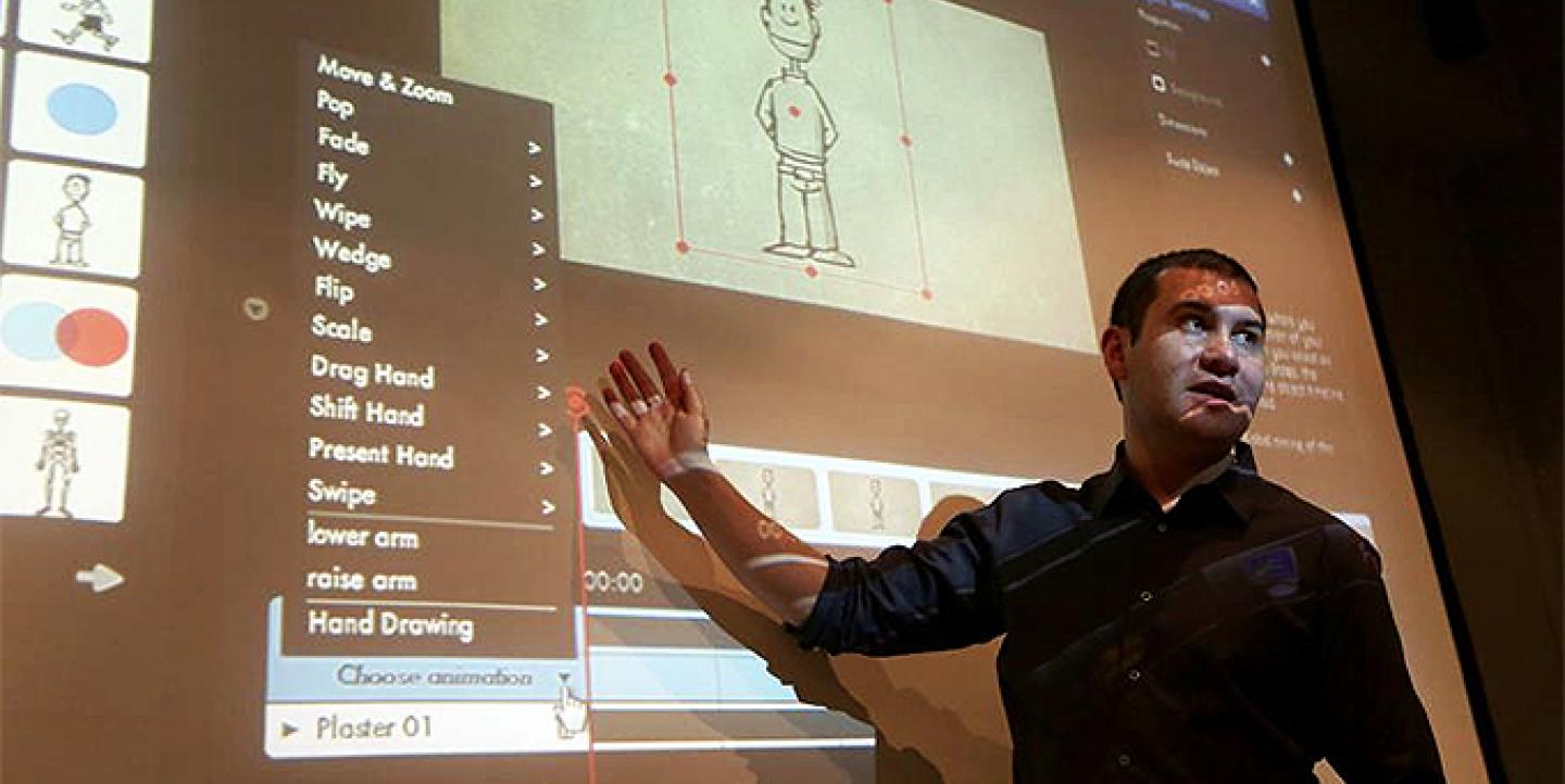
Journalist Wilson Liévano spent his 2013 JSK Fellowship year exploring ways to use data animation to tell stories. He created Animated Press, a news animation studio and has produced animations featured by The Guardian, Al-Jazeera and the Wall Street Journal. This month, he will lead free webinars hosted by The Institute for Justice and Journalism that could help you create your own animated videos using a free cloud-based software Moovly. We asked Liévano to share his top tips for producing data animations.
1. Define your concept
A good part of the success or failure of your animation rests in how well you define what you are going to talk about. You only have a couple of minutes to explain your topic, so choose carefully what aspects you are going to focus on. You can answer a single question or explain all the aspects of a topic, but you need to know exactly what you are going to say about it. Think of it as defining the “nut” graph of a print story.
2. Take time to storyboard
The storyboard is the backbone of any animation, even when you use a program like Moovly that already comes with images and pre-made animations. Take your time to draw and describe, scene by scene, exactly what movements will occur and in what order. Your storyboard should have the complete text voiceover, word by word in order to have a approximate idea of the total length of the animation. And don’t forget to detail sound effects, colors and music if needed.
3. Do a mock run
Sometimes, ideas that look good on paper might not translate well to the screen. To avoid that, it’s good to take a picture of your sketches for every scene, upload them to a video software and make a quick little video flip book that will give you a good idea of how it would look on screen. This little trick would take you 10 minutes of work, but could save you hours later.
4. Audio first, images later
Audio is the foundation of every animation. It determines how much time your visual elements will have on screen. If you record the audio first you will know exactly where to start and end an animation, where to leave room for sound effects or silence and where to use images to emphasize what it’s being said.
5. Keep your data simple
The first impulse might be to animate all the data you have, but time and the attention of viewers is limited and a barrage of numbers and charts on screen can alienate some viewers. Instead, you can weave only the most important bits of data with a compelling narrative and entice the viewer to explore the rest of your data after they finish watching the animation. Think of the animation as a highlight reel for only the most important bits of data you have.
6. Be creative with your visualizations
Now that you selected the highlights of data you want to animate, think of how you would visualize them. Sure, you can use lines, bars and other types of charts, but do it sparingly or you would run the risk of transforming your animation into a glorified slideshow. Use other graphical elements, like icons, characters and text to find ways to tell the story behind the numbers.
7. Keep it short, between 2 to 3 minutes
For the first animation I did I chose a total run time of five minutes because I considered it sounded catchy and was short enough. After all, if someone tells you that they will explain something in five minutes it seems like a very small amount of time. But online it’s an eternity. Most online video editors suggest a length of between 2 and 3 minutes to keep the attention of your audience.
8. Keep your images moving
Just because the average viewer’s attention span is 3 minutes, that doesn’t mean that you can’t lose them along the way. From the very first frame you are waging a battle to keep your viewers engaged. A common mistake when you start is to leave elements on the screen for too long or, even worse, static until the voiceover of a particular scene ends. When there is nothing moving on the screen, the viewer unconsciously interprets it as a cue to stop paying attention. To avoid this, time your elements so there is always something happening on the screen.
9. Do not overdo motions
Although you want to always have things moving on screen, you can also overdo it by having too many things competing for the attention of the viewer at the same time. Have you seen how good designers craft a magazine layout so that readers follow a narrative line? You can do the same on an animation. Yo control what they see and when they see it, but subtlety is key. The action should flow naturally. Trust your instincts and your taste to find that middle ground.
10. Don’t forget your sources
Many animators forget this. You can list your sources and further readings on the on-screen credits or in the description of the animation. It’s a great way to engage viewers with the rest of your data or the content you had to leave out of the animation.
Resources: You can find multiple templates for storyboards at The Flying Animator Blog. All of them have their advantages and disadvantages, just pick the one that works better for you. Is not easy to find free music or sound effects, but you can find some at Audio Jungle. Many are for sale, but they are not very expensive.
Wilson Liévano is now a multimedia coordinator for Wall Street Journal Americas and he’s working to spread know-how about data animation to his fellow reporters.
This article originally appeared on the John S. Knight Journalism Fellowships at Stanford blog and is posted on IJNet with permission.
Image courtesy of Aurelia Ventura/IJJ.

