
When you hear the words “data journalism,” you also often hear words like “revolution” and “future.” But — according to a new paper that looks at a couple hundred international data journalism projects nominated for awards over four years — most of the journalism itself hasn’t changed as much as you’d think: It still mostly covers politics, it’s still labor-intensive and requires big teams, it’s still mostly done by newspapers and it still primarily uses “pre-processed public data.”
“Our findings challenge the widespread notion that [data-driven journalism] ‘revolutionizes’ journalism in general by replacing traditional ways of discovering and reporting news,” write Wiebke Loosen, Julius Reimer and Fenja de Silva-Schmidt in a paper published online last week in the journal Journalism.
Loosen and Reimer, both from the Hans-Bredow-Institut for Media Research in Hamburg, Germany, and the University of Hamburg's De Silva-Schmidt analyzed 225 projects that were nominated finalists (not just submitted) for the Data Journalism Awards between 2013 and 2016, logging data sources and types, visualizations, interactive features, topics and producers, to see how projects changed over time, how award winners differed from projects that were only nominated and where there might be room for innovation and improvement. Why look at these projects? They’re “what the field itself considers to be significant examples of data-driven reporting,” the authors write, and the winners are likely to shape future development of the field.
Here are some of the trends seen across the 225 projects:
Data journalism is still very labor-intensive.
Of the 192 projects in the sample that had a byline, they named on average “just over five individuals as authors or contributors.” About a third (32.7 percent) of projects were done in collaboration with “external partners who either contributed to the analysis or designed visualizations.”
Newspapers are still doing the most data journalism and winning the most awards for it.
A total of 43.1 percent of the nominees and 37.8 percent of the award-winners were submitted by newspapers. After that:
Another important group comprises organizations involved in investigative journalism such as ProPublica and The International Consortium of Investigative Journalists (ICIJ), which were awarded significantly more often than not (total: 18.2%, DJA-awarded: 32.4; only nominated: 15.4). Print magazines and native online media (8.4% each), public and private broadcasters (5.8 and 5.3%), news agencies (4.4%), non-journalistic organizations (4.0%), university media (3.1%) and other types of authors (2.7%) are represented to much lesser extents. Interestingly, stories by print magazines, news agencies and non-journalistic organizations have not been awarded at all.
It’s a lot of politics.
Almost half the analyzed pieces (48.2 percent) covered a political topic, followed by “societal issues” like census results and crime reports (36.6 percent), business and the economy (28.1 percent) and health and science (21.4 percent). “Culture, sports, and education attract little coverage (2.7 percent to 5.4 percent).” Most of the projects also dealt with only one topic category, rather than “spread[ing] into two or more different topical areas (e.g. political decisions and their societal impact by investigating how weapon laws influence the number of mass shootings).” The authors wonder if this is a function of industry awards being biased toward more serious topics.
Data journalism is becoming more critical.
Fifty-two percent of the pieces analyzed included “elements of criticism (e.g. on the police’s wrongful confiscation methods) or even calls for public intervention (e.g. with respect to carbon emissions)…This share grew consistently over the four years (2013: 46.4 percent versus 2016: 63.0 percent) and was considerably higher among the award-winners (62.2 percent vs. 50.0 percent”).
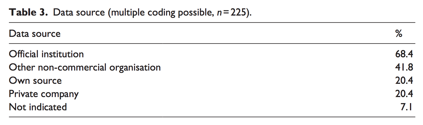
Most projects still rely on official (rather than originally collected) data.
Probably not surprisingly, award-winning stories were more likely to contain “data obtained through requests, own collection or leaks.” The authors were surprised, however, that “despite data journalism’s often-cited association with openness and transparency, in over two-fifths of pieces, journalists did not indicate at all how they accessed the data they used.”
Visualizations haven’t gotten much more sophisticated.
Static images and charts were still found the most frequently; “typical combinations of visualizing elements include images with simple static charts (40.0 percent of all cases) or with maps (32.4 percent) as well as maps coupled with simple static charts (31.1 percent).” Award-winning pieces were more likely to be visually rich.
Interactivity is “a quality criterion,” but sophisticated interactivity is really rare.
Zoomable maps and filter functions are most common, perhaps because they’re often already included with free software tools that data journalists are likely to use. “Our results are in line with others’ observations of a ‘lack of sophistication’ in data-related interactivity…they often include only ‘limited possibilities for the audience to make choices’ or ‘minimum formal interactivity’ simply ‘for interactivity’s sake.'” It’s also unclear how much audiences actually want interactive visualizations in news stories.
Overall, the authors find, data journalism is still labor-intensive, slow to respond to breaking news and reliant on the domains that already regularly produce data, such as elections. “Lacking those important characteristics of journalism — currentness and thematical universality — data journalism is more likely to complement traditional reporting,” the authors write, “than to replace it on a broad scale.”
This story first appeared on Nieman Lab and is republished on IJNet with permission.
Main image CC-licensed by Flickr via JoSullivan.59.