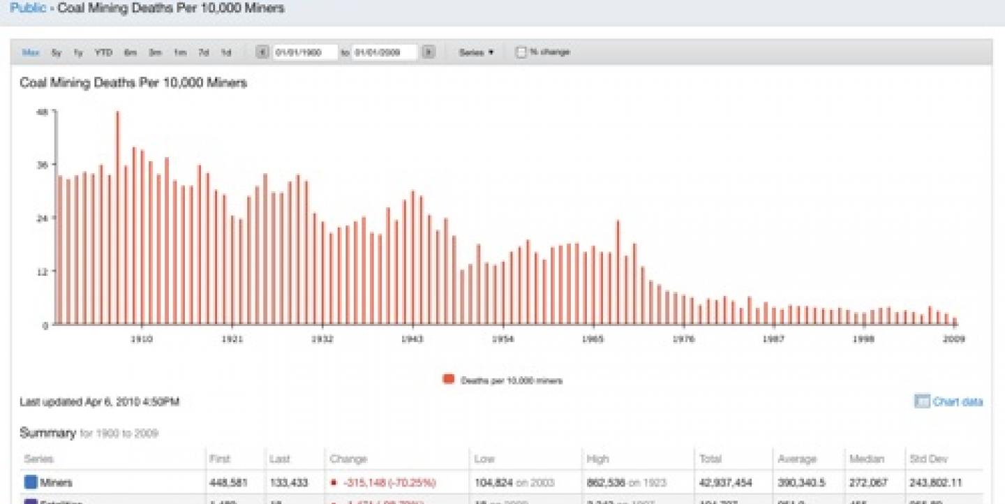
Regardless of whether you work for a print publication or for broadcast, chances are good that your news organization also has a website. One excellent way to enhance any story is to include some sort of data visualization with your work. This way, you'll be able to incorporate colorful, moving charts and graphics into your articles to provide better context and to offer your readers a chance to interact more with your story.
There are a number of free data visualization tools available for free. All you need to do is to create an account, upload your data and pick a color scheme!
Swivel
Swivel has actually been around for a number of years in alpha and beta versions, and we're happy to say that they've finally worked out most of the bugs. The interface is very simple to use, and you can even upload your data from an Excel spreadsheet or csv file. Here's one example of a chart that was created to show the number of coal mining deaths in a recent mine explosion in West Virginia, U.S.A. Swivel can be embedded onto any website.
Revisit
Revisit is a new real-time Twitter visualization tool that gathers tweets about a central topic and then showcases them along a timeline. From the creator: "Use it create your own twitter wall at a conference or an ambient display at your company or whatever other idea you come up with. In contrast to other twitterwalls, it provides a sense of the temporal dynamics in the twitter stream, and emphasizes the conversational threads established by retweets and @replies."
amMap
I've mentioned it before, but with the recent volcano eruption in Iceland, it's worth repeating. Take a look at amMap which is a popular free tool currently being used throughout many newsrooms including USAToday.com. It creates beautiful Flash maps and charts and lets you easily customize size, color, etc. of your map, create map charts (heatmaps) and even make the map auto-play a timeline. For example, here's an amMap of Iceland. It wouldn't take much to show the path of Eyjafjallajökull's destruction or the effects that the ash clouds have had on travel throughout Europe.
Amy Webb is a digital media consultant and the CEO of Webbmedia Group, LLC. She has also launched Knowledgewebb, a new website for multimedia training. You can follow Amy on Twitter. Webbmedia Group is a vendor-neutral company. Any opinions expressed about products or services are formed after testing, research and interviews. Neither Amy Webb nor Webbmedia Group or its employees receives any financial or other benefits from vendors.

