To sustain user attention and drive audience engagement, journalists and news organizations should learn to use data visualizations.
Data visualizations let you explain a set of data simply with an infographic, an interactive application or a chart. With multiple stories competing for users' attention on the boundless Internet, data visualizations are a creative way to interest users in your content and add context or a different perspective to your story.
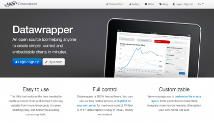
Leading media organizations are using Datawrapper, a simple and free tool, to improve their storytelling this way. Datawrapper is an interactive chart app that can be embedded into stories such as this one, which shows the Nigerian government's proposed budget in 10 charts.
As an ICFJ Knight International Journalism Fellow in Nigeria, I work on using digital methods to support journalists in improving their storytelling and driving a wider engagement. Our team of fellows and our local HacksHackers chapter) in Lagos recently organized a data journalism class focused on how to use the Datawrapper application to strengthen storytelling.
Our class participants had never used DataWrapper, but it's so simple to use that they have already returned to their newsrooms and created these visualizations:
--Infographics on population and economic growth
--Social media is a driving force for data demand
Using DataWrapper is easy. Here's how to get started:
- Step 1: Find a data set
You'll need a set of data in spreadsheet format. In this example, I'm using a data set obtained from Nigeria's Budget Office of the Federation. If you don't have your own spreadsheet handy, use the same one I did so you can try out Datawrapper and understand the power of the tool. The budget spreadsheet is available for free here as a Google Doc.
- Step 2: Log in to the Datawrapper site through an email address or Twitter password.
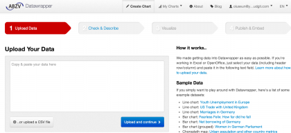
- Step 3: Then, copy and paste data from a Microsoft Excel spreadsheet or upload a CSV spreadsheet document.
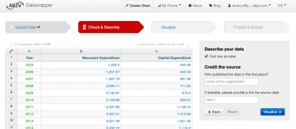
- Step 4: The DataWrapper application translates the data into a table and displays that for you. You can add data sources and also links if you have them. If the table looks ok to you, click the "Visualize" button.
- Step 5: Next, you'll see the “Visualize" tab, which shows an array of chart types that you can use.
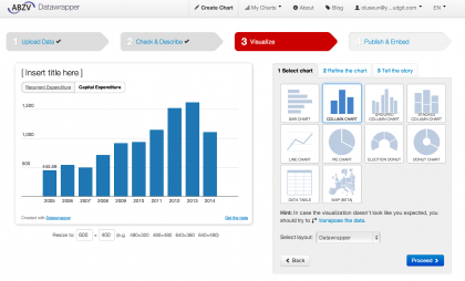
Do you need help figuring out which kind of chart to use? Check out this guide.
Mini-tabs can help in refining the chart. They let you add titles and descriptions, as well as change the layouts.
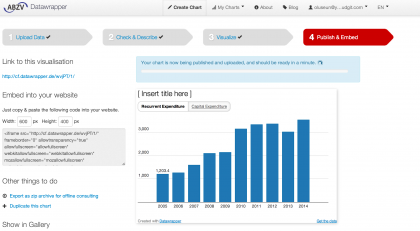
- Step 6: Finally, you can copy and paste the embed code and publish the chart. (If you need to correct the chart later, you'll need to republish the chart to get a new embed code.)
I hope you'll try out DataWrapper and publish your visualizations on your news site or your own blog. When you do, please share your links in the comments section below.
Oluseun Onigbinde is a digital innovator and open data advocate. As part of his ICFJ Knight International Journalism Fellowship in Nigeria, he promotes the use of creative digital tools in media organizations to increase public engagement around key development issues such as health and education.
Global media innovation content related to the projects and partners of the ICFJ Knight International Journalism Fellows on IJNet is supported by the John S. and James L. Knight Foundation and edited by Jennifer Dorroh.
Photo courtesy of Oluseun Onigbinde.

