The riots in the United Kingdom have dominated the news for the past five days.
Amid the chaos, the record Twitter traffic and the constant streaming of photos from the streets, many news organizations put together powerful infographics that explain and inform on the breaking story.
Here are IJNet's top picks for infographics that put the U.K. riots in perspective.
The Guardian has put together a nice multimedia package that includes an interactive map of the incidents, an interactive chart of the riot charges, a map using photos uploaded by users and even a downloadable list of every verifiable incident.
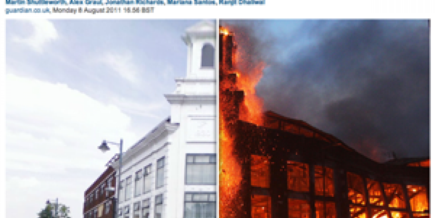
The Telegraph crafted a very cool interactive piece that shows images before and after the riots. All you need to do is move your mouse over the images. The Guardian also has a great piece that uses very powerful photos here.
Other news organizations created interesting static infographics. Some examples include Ria Novosti, Russian news and information agency, El Pais (Spain) and Reuters.
The BBC created a fascinating multimedia piece that uses videos and a map. A second part includes an interactive map that shows how riots spread geographically.
Finally, this map made by James Cridland, managing director of Media UK, who also wrote a post describing the difficulties of mapping the incidents.

